Although it may seem otherwise, in DesdeLinux we never stand still. We always look for a way to innovate to change the routine and that is why I have been working on a new mockup to launch a new design in 2013.
For now they are just ideas and of course, everything may be subject to change. I write precisely this post so that you can share your ideas with me and give me suggestions.
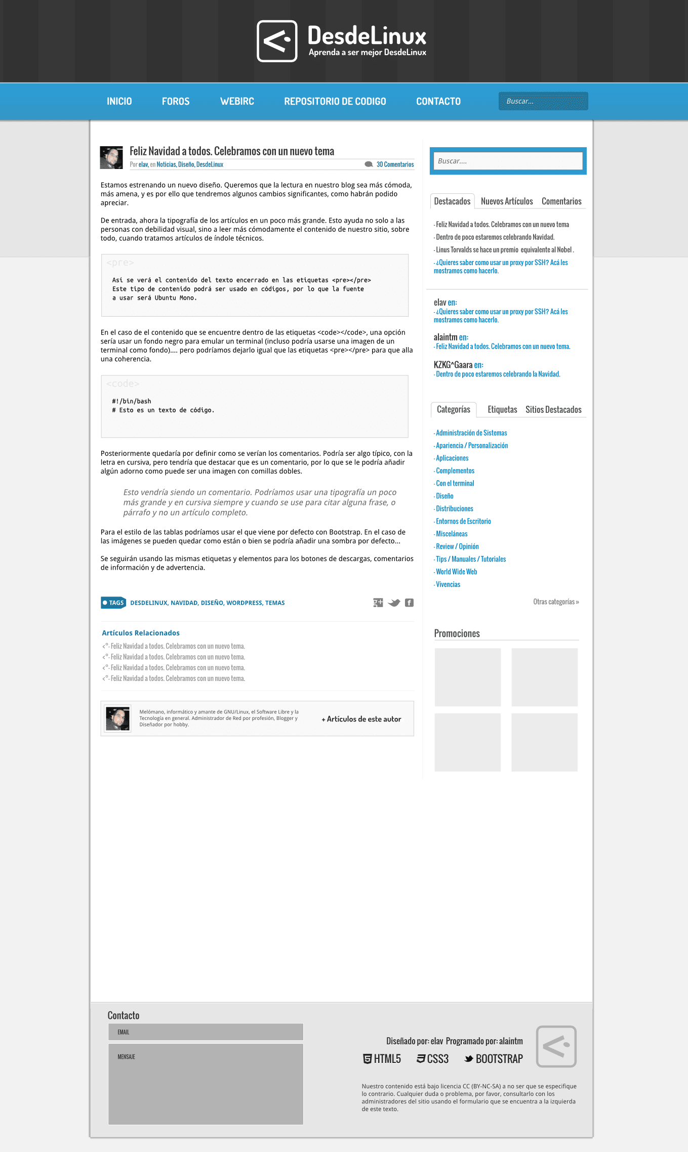
This new proposal aims to use a cleaner design (without so many rounded edges) and change some things like the floating menu bar. Also, as you can see, I have used a header a little bigger to highlight our logo more, although this is under review as I have to see to what extent it could affect the way the site is displayed on small screens (Netbooks and others).
Apart from the visual aspect, this new design will also have corrections under the hood, things that were pending and we did not take into account when we launched the current proposal. Some of these changes are:
- Style for tables.
- Eliminate excess margin in images.
- Corrections in the styles of the text and typography.
Among other fixes that we consider based on the feedback we receive when we announce the current design.
As you can see in the subsequent image, there are elements (number of times read a post, or the text read more) that will only be visible when hovering over some links. In addition, the contact form will be available at the foot of the site so that anyone who wants to communicate with us can quickly have this option.

Also the way the articles will look will undergo some changes. One of the novelties is that, where is the author's information (which is now also specified at the top) at the end of the post, there will be a link where we can access all the articles that he has written.
We will also apply a style for the code, comments and more. The menu bar would be as in the first image, that is, smaller by the vertical. There are many elements to define (colors and others) but it would be more or less this way:
Well, nothing, I think there is nothing left for me to say. As always I await your comments, suggestions and criticisms .. 😉
I just liked those edges xD. But hey. It would be great
I hope it is because it is a beta version. But the profile and the distro used xD are missing
When does it come out?
Indeed. The mockup does not contain those details as I did it on the .svg of the previous mockup. But it will have the social icons, the distro we use and everything that you can now see in the sidebar ..
I agree. I also liked those edges. In general I like the current style better, but hey ...
I would love to see the final version hehe but the only thing I don't like very much is the black bar at the top where it says «DesdeLinux»It seems to me that at least the bar we have now is better
Well, yes, that black background with stripes is one of the elements that we must change ... but I still haven't decided on something better.
I like how it is black, but it would take up too much screen space I think
I do not like that the dates do not appear in the publications or comments and instead the days or hours appear.
You are going to see an old post, for example, and it puts you (237 days ago) now find out what date those 237 days are ¬_¬
That is driving me crazy. >.
And if you put the mouse / pointer over that text from (237 days ago) ... doesn't it tell you exactly the date of the post? 😀
I had not noticed that, nor did I know that option !!!
What a horrible ridiculous thing I have done LOL
Well, I am joining my colleague's comment .. Did you put the cursor on the 237 days? xDD
hahaha is what it has to be bald, you are losing faculties 🙁
That banersote thing (Desde Linux) about the blog navs seems very exaggerated to me..
That is variable .. 😀
I just love it, although the dynamics of the page somehow reminds me of the twitter page xD, but ignore me I'm a little crazy. Excellent arrangement of the entrances and the combination of colors. maybe a little more mate.
Thank you helena_ryuu ^^
[Ironic mode ON]
Implementing metro in DesdeLinux, huh?
[Ironic mode off]
What's up, it's very cool. Still based on Bootstrap, right? A tutor would be good
how to do things like this.
Yep .. Bootstrap to the core 😀
I like the new design, although as they say above it would look better a little more matte. It reminds me, as they have also said, of Metro or Twitter, but I would leave it with those colors lol. I love the black bar, it would be a good detail to hide it while you scroll and the blue bar to be visible while going down. Congratulations, your designs are some of the best I've seen on the Internet.
I find it very useful especially that now the author's name appears in the header of the article, as well as that there is now a link to look at the other articles written by him, since before it was only possible through the general view by clicking on the Name. Curiously, I did like the edges, but of course this will have to see the general opinion, in any case as always a great job Elav with the blog design!
I like the new design. I like the minimalist trend that the site is acquiring. I like the proposed top bar better than the current one.
See you soon!
First of all, congratulations for making DesdeLinux, not only good for its content but also for its design.
I like the idea of changing the floating bar and the option to read more articles by this author.
Are you already tired of the current version elav? XD
In fact, he got tired of the current version literally two weeks after we put it on ... God, this one can't be without changing everything for 6 months 😀
Here is a suggestion for the site.
What would seem to have the floating bar at the top, and in it include the logo of the distro with which we access.
Below the bar, see the static blog logo on the page, although a smaller version of the logo can be included in the floating bar.
In the same floating bar include the data of the members, that is; the nickname and avatar.
Cheers..!
I really like that idea of including our distribution in the floating bar and also the data of the members 🙂
How about, the new design looks very good, personally I would not change the colors much since that is how the blog is identified.
Good job
regards
Seriously, EVERYTHING is programmed only with HTML5 and CSS?
HTML5 + CSS3 + jQuery 😉
I like this 🙁
+1 for the new design, I like the headboard in black gives it more "weight" and is more elegant. Petition: a system for evaluating comments (hand up - hand down)
I don't know, I like the current design, it seems very professional.
very good to keep improving the page.
Thank you all for your comments. We will take them into account and well, since things are close, maybe we will take this to a vote.
hello elav, thanks for making such an interesting blog 🙂 for me it is the best linux blog. Here is a suggestion… that the comments that we post have the option of liking or disliking….
I would also like if it is possible to add tabs with logos or something like that (you are the ones who know how to do things, I do not know much about this) with the most used distros Ubuntu, Debian, Fedora, Arch Linux, SuSe for that users can access the news and tutorials of our distribution
I don't know about you, but from my own experience I know that likes and dislikes are good at attracting trolls, and users would compete to write the best comments. I say, I don't know much lol.
Someone explains to me that it is a troll ... I don't know what that is: '(
Ehem, sorry for answering you a little late, but trolls, I really don't notice sarcasm in your comment, they are those people who introduce annoying comments or express opinions in an offensive or annoying way.
The bar now seems too big to me, I don't tell you if you put an even bigger one. You have to think that the screens (at least of the laptops) are longer than they are high and everything that is above (or also below) the screen makes viewing the content difficult at the last moment.
You can always move the logo to a corner and make it "float" (I don't know how to say it in Spanish), like the up arrow at the beginning of the article, and leave it in a corner, but not a whole bar.
I think the same about the bar, very large. It is preferable only one, and that the background is like the one above, but that it changes according to the distro 🙂 Perhaps it would be difficult to do, but the touch of elegance that it would give ... is it worth it? ^^
The rest, I like how it turned out. And it is VERY appreciated if you put the author at the top, whenever I open an article the first thing I like to see is who wrote it to understand it better 😛
I know it's a bit late to ask for likes, but I've looked at some screenshots of the blog layout before, and I've noticed that for the distros we use they had icons similar to faenza. I don't know, but I think they would look good.
The design seems good to me, the only thing that needs to improve is how the images are treated, the truth is a nightmare that every time we want to see an image in a larger size they take us out of the main content to see it and to return to the content we have to press the "back" button, which is more work and being honest, web users are lazy and the more actions we have to do to get to the content the worse, or what is worse, not only does it not open the image but it sends you to another page where you have to press a link to open the image in the desired size when I think, it would be easier to open the images in a lightbox and thus avoid abandoning the content, even so I want to say that it is for me the best blog of linux and all its content is of high quality and also easy to understand
they could release the design to model it, it's very good