For a long time we have not updated the current blog topic, and it turns out that Pablo (let's use linux) has made some modifications that we found interesting to implement.

The design does not change in its entirety, only some visual details. We see some of them.
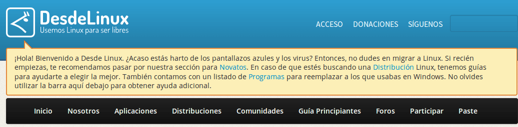
We have eliminated the buttons at the bottom of the Blog (Latest comments / Donations / etc ..) and placed them in the header, next to the search engine.
The first time we access the site, we will be able to appreciate a Pop Up inviting new users to visit some recommended links. If they want to see the Pop-Up again, they must clear the Cookies on the site.
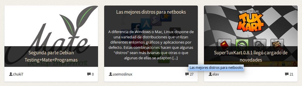
As you can see, the effect of hovering over articles has changed. Now they are displayed in a more elegant way using the power of CSS3.
When we access an article, we can read the one that follows thanks to an arrow that we have placed for that purpose:

Other details were added that are not implemented right now due to old CSS properties overwriting them (something I will correct in the next few days).
We have modified the appearance of the buttons, some icons and other elements in the articles and the theme in general.
Important adjustments have been made, such as the Editors when placing a Download button, it will automatically be centered in the article.
Despite all these news, I must say that we are working on a new design for the blog, with new functionalities and visual details, which will be published in the coming months. We want to test it well, so it will take a while.
As always, any problem they present is reported to us so we can correct it as soon as possible.
I like the thumbnails of the articles. Very nice
Thank you, I am very glad that you like them!
With elav a while ago we were looking to update them. 🙂
Hug! Paul.
Thank you very much for sharing your art and your time with everyone.
"Salud"
You're welcome! The truth is that it was an ant effort that I have been doing for several weeks. 🙂
Hug! Paul.
Well… I don't see neither the logo, nor the donation buttons, etc. on top. I've already taken care of flushing the Chromium cache. However, in Firefox it looks perfectly. In Chromium and Midori I do see the buttons on the main page, but I still don't see the logo.
Idem.
The Logo problem should already be fixed. It's amazing, so advanced that Chromium is and it can't do things that Firefox does with its eyes closed.
After clearing the cache, it works on chromium.
Same here, both in Chromium and Midori 🙂 I love the changes.
The Design seems great to me, 10 points, but I have a small observation with the hover event in the articles a pop-up is superimposed with the name of the article and the new effect that was added. In my opinion, in my humble opinion, the hover event should disappear with the pop-up. Well that little detail and thanks for the efforts you make sharing in this blog ^ _ ^
It looks great, I like it =)
Thanks, Manuel!
Hi Elav, Very good!
I really like the preview of articles on hover.
I have a PROBLEM: I cannot see the buttons «Access Donations Follow us» using Firefox 26.0
Don't you see them next to the search engine in the header?
Hello, now they are.
Eye! They appear only on the main page. 🙂
This is so because the login and the data of the social networks appear in the sidebar in the articles.
Cheers! Paul.
Now works better with Opera, great.
In Chromium Version 28.0.1500.71 the logo does not appear Desdelinux ..
Is it my feeling or is the last comment gone? I write from ie11, I will try later with opera 18.
Yep. The link was removed because according to some, it was not necessary .. What do you think?
Hehe… IT'S unnecessary… WE ARE NOT TARINGA! Haha…
Nah, seriously ... I don't see much use for it, really ... but it's debatable.
Hug! Paul.
Well, not necessary, only sometimes I would like to know what the last discussion is, without having to enter each of the articles xd, I will have to use the comments panel, to see XD
in opera mini you have to click (tap? I don't know how they say it on touch screens) on the logo of the comments made in the article to enter the article.
Yes I know, click on the image or title and send it back to desdelinux.net
I also do not see the last comments, did they remove it?
Ah! and although I have good math, the captcha marks me an error VERY VERY often, so there are articles that I cannot comment on.
I see that it was published 😀
It seems like a more "square" theme so to speak, I like the buttons a bit rounder. Although I don't know if it's because I'm on Windows.
The detail of the home page… good!
Yes, we will also include a "Beginner's Guide" on Linux. The blog is too "geeky", which on the one hand is good but on the other it scares those who are just starting and do not even know what a distro or a desktop environment is.
That's what I'm going to put myself into these days ... write the happy guide. 🙂
Cheers! Paul.
All right, I like the idea.
Strongly agree. I already saw the button at the top 😉
I forgot. I think they should remove the part about the blue screens and viruses, it seems to me that DesdeLinux It is a fairly open community, and it is better to highlight the virtues of GNU/Linux than to highlight the failures of others.
If true. There is no need to make comparisons with other systems and less take their defects as arguments. While that draws people in and it's those other OS 'flaws that are the reason they decide to migrate to GNU / Linux, there are bigger things to consider.
I agree to change that part of viruses and blue screens. Words such as: free, secure, adaptable could be included.
Whenever important changes have been made to the blog, readers are given the opportunity to give their opinion and be able to all choose their course in the best way. I already gave my opinion, I hope this is debated in a good way.
Pablo, if you want, I'll give you a hand, tell me what to do and I'll help you!
Regards!
LEO.
the newbie link takes you to 404
Yep… it's under construction… I'll fix that. I was waiting for elav to raise the theme.
This is the best linux blog I have ever known, congratulations for your effort! 😀
It seems incredible that in Chrome I did not just go, but in Internet Explorer if…., Well …….
Cute! 😀
: stunned:
Just let me congratulate you for doing such a good job of making an excellent makeover to the blog topic.
And by the way, now they have known how to take advantage of the free space that was in the upper part of the logo
I have noticed that it no longer shows the desktop environment in comments (my comment sounds very OffTopic). : p