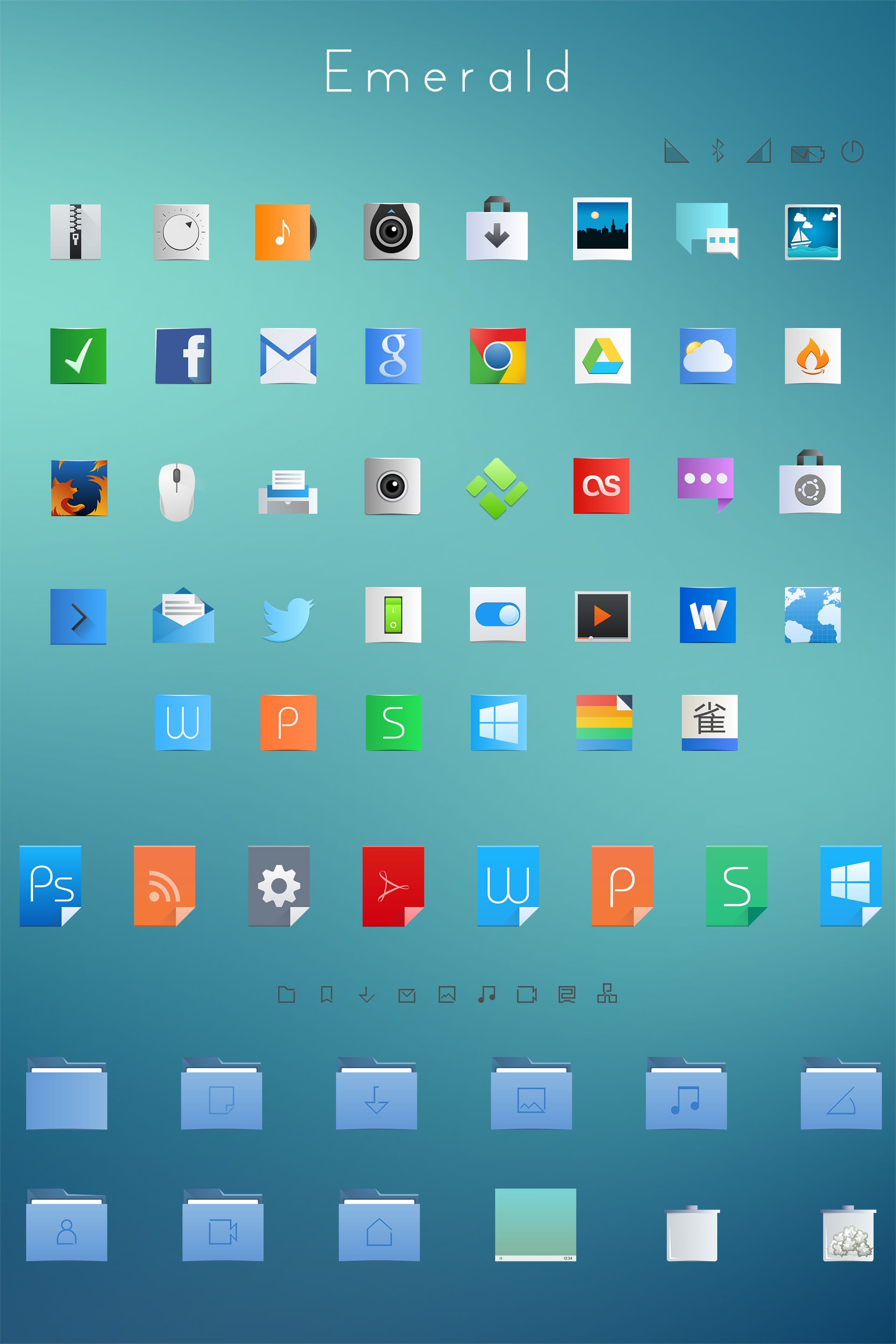
Since the Flattr icon theme came out I have been using them non-stop until a few days ago when I found out about a new icon theme called Emerald. Emerald is actually based on Flattr + Breeze (the latter being the new KDE 5 artwork) and they really look beautiful.
![]()
Download Emerald Icon Theme
The icons are available under a Creative Commons license (CC BY-NC-SA 4.0) and can be downloaded from the following link:
Now, to install it we can use several methods. From KDE Preferences they could be installed perfectly, but only when the files are compressed in tar.gz, and since the download file is in 7z, we will have to use the console or simply copy the folders Emerald y Emerald-Dark for ~ / .kde4 / share / icons / and that's it.
Brilliant!
Of the best I've seen, I'll try to install them in elementary when I manage to solve my WiFi problems (RTL8188E) hahaha 🙁
They are nice yes, but I like the Flamini icons better :-).
They are very nice icons, I use some similar ones, the dynamo that are also based on breeze, I'm going to try them.
Sorry for the clarification, I hope it doesn't bother, but kde 5 does not exist, it may be plasma 5, kf5, but not kde 5 🙂
I still believe that the best icons are those based on Faenza and Awoken, I also like elementary ones but there are many applications that do not have an icon, why not develop something more sober for day-to-day work?
I can't imagine using this set for more than a week.
I tried it a week ago. It's good, but it's missing a lot of mimetypes, weather icons, and several. Definitely, FaenzaFlattr is the best and most complete.
They are very good. I had already tried them, but several important icons are missing.
By the way, I am consulting something that maybe someone knows how to solve. It turns out that if I use an icon pack other than Oxygen, the GTK apps come out with very ugly icons. Now, if in the GTK application appearance preferences in KDE I configure so that they use the Oxygen icons, why do they use others?
This happens whenever you choose an icon pack other than Oxygen for Qt applications.
That can be easily fixed, well at least for gtk2 apps, in your home check that the .gtkrc-2.0 file exists and if it does not exist create it
# File created by KDE Gtk Config
#Configs for GTK2 programs
include "/home/your-user/.themes/Atolm-gtk3/gtk-2.0/gtkrc"
style "user-font"
{
font_name = »DejaVu Sans Condensed»
}
widget_class "*" style "user-font"
gtk-font-name = »DejaVu Sans Condensed 9 ″
gtk-theme-name = »Atolm-gtk3 ″
gtk-icon-theme-name = »FaenzaFlattr-Gray»
gtk-fallback-icon-theme = »FaenzaFlattr-Gray»
gtk-toolbar-style = GTK_TOOLBAR_ICONS
gtk-menu-images = 1
gtk-button-images = 1
Now in addition to that create a symbolic link of the icons that you are going to occupy, for example FaenzaFlattr-Gray that would be found in ./kde4/share/icons and create a link to /home/usuario/.icons and finally look in the folder From the icons the index.theme file and edit it, in the line that says Inherits = you add Oxygen (it also works for icons to use gtk icons in kde), example Inherits = FaenzaFlattr, Oygen
Many thanks! It worked perfect! Just add that the word "oxygen" in the "Inherits" field must be in lower case.
They should write an article with tips to unify the appearance of the applications, since in Linux it is a topic by itself.
they are cute
for now I use nitrux they are quite nice
It will look great on my gentoo
Very good icons. Quite nice
Excellent!
I was using Numix Circle and the truth was that I felt in Manjaro For Kids haha