KDE It is for me the environment with the best finish / finish, I definitely like it above the rest. Although I always thought that the colors that come by default are not ugly or unpleasant, but they lacked "life".
I have just discovered some colors that are magnificent, it is just what I was looking for ... really, I find them perfect *-*
I leave you some applications, so you can see what I am talking about:
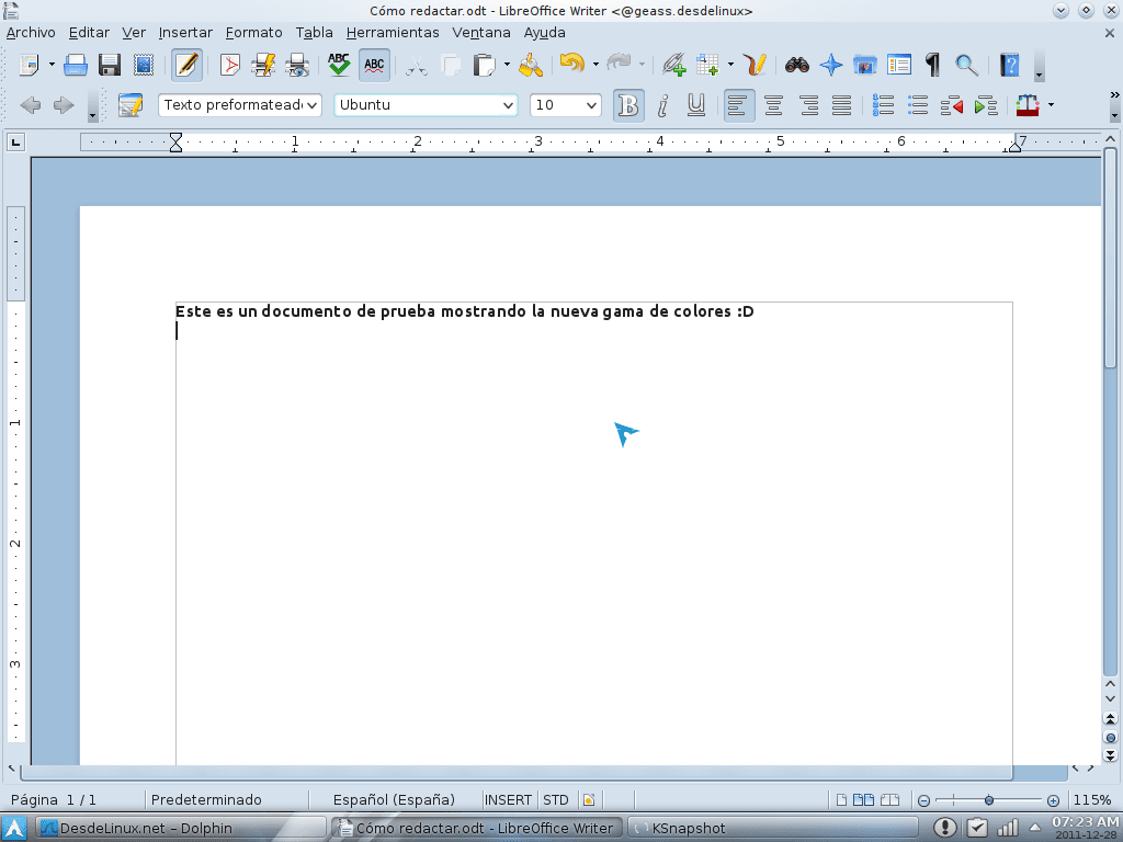
![]()
To have these colors (actually they look a bit sharper, but in the screenshots they got a bit opaque hehe) is very simple.
1. Open a terminal, in it write the following and press [enter]:
cd $HOME && wget http://kde-look.org/CONTENT/content-files/147817-ForkedIaOraSteel.colors
2. Once this is done, we must open the System Settings, and go to Appearance of Applications:

3. When we double-click on the option I indicate above, another window will open, in which we select «Colours»In the menu on the left.
4. In the area on the right, we will be shown the ranges of colors that we have available, to install this new one that we download, click on the option «Import scheme ...«
I leave you an image of these last two steps, so that you understand better:
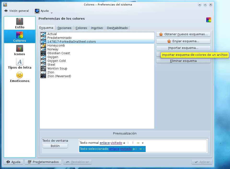
5. Once we click on Import schema, a window will open through which we will search in our personal folder (home) for the file that we have just downloaded (10147817-ForkedIaOraSteel.colors) and we double-click it.
6. Done, it only remains to select it (as selected in the previous image) and click Apply. These wonderful colors will be put on them 😀
These colors made them salim salim and I met them thanks to Kde-Look. A thousand thanks to him for this work hehe, it's just what he wanted 😀
Greetings and ... tell me, Do you like these colors or not? 😉
For my taste too loaded with blue, the one that is very beautiful is the rabid yellow, hahahahaha.
Well, I love that blue 😀
just a little less yellow and the colored buttons and it would be perfect, I prefer the Smoothoctans range of colors. 8)
No idea what it is, if you are so kind to put the link 🙂
I'm already copying Courage, hahahaha.
Man, I have installed it more than anything because it does something with the QSQ theme for Firefox that also uses that blue color that is my favorite color. Not bad. The only thing that instead of so much terminal step can be installed directly from the system preferences which I think is faster.
Ah yes hehe you are right 😀
What happens is that I am not used to using those options to install directly from the internet, so I forget that they exist ^ _ ^ U
It does not happen na xD. As I am relatively new to this, I suppose that I still do not get used to using the console and those of you who are more involved in this I suppose that you enjoy it and with it. It is a pending subject that I have;).
I use the Caledonia theme color game !!!!
I, like Marco, use the Caledonian color range, their combinations seem very soft and not loaded at all ... Yours is too bluish for my taste.
the colors are very office 2007 xDD
Exactly, what KZKG ^ Gaara didn't say is, he's a fan of Windows colors.
that explains everything. 🙂
Thanks for the tip, here is the scheme that someone named above:
http://kde-look.org/content/show.php/Smooth+Octans?content=117514
Thanks for the link 😀
I have tried Smooth Octans (the normal one as there are several ranges) and I think it fits me more than the previous one because what did not convince me of this one was the yellow color that appears in the tooltips of the system preferences (I'm sorry xD). Now I will look at the Caledonia that also sounded familiar to me by name.
By the way, I just remembered, since we are talking about customizing the environment, a classic question that you would comment on in some other post, apart from Faenza, do you know of any other group of icons with a showy and elegant style that fits, I don't know, with light blue tones and that it supports all sizes of icons, etc.? Thank you.
I advise you to use either the Caledonian or the Allgrey icons
Faenza has its versions with blue tones, at least for the folders. Faenza Cupertino is an example of them 😀
mmm nope, I don't know any other like that 🙁 ... it's that with Faenza, well, I haven't dedicated myself to looking for others haha
I have not yet gotten to try what you say, so for the moment I am staying with Faenza, let it be known that I like them, but it seems that everyone is going for the same ones. At first I did not want to touch anything of the initial aspect because it is already fine but now between the range of colors, the minimalist and blue wallpaper and others I think I have achieved a very nice blueish style.
What doesn't convince me of the Smooth Octans chosen (a little detail) is that when you move the mouse cursor over one of the toolbars, it doesn't highlight it or "frame" it as the other did, but come on, little details of na. The buttons look good.
I'm going to recommend the "Ia Ora Blue" color scheme, try it, you're sure to like it
The one you mention I have tried and it is good but curiously I have tried another with a name, let's say, similar: Blue Sora and it does not look bad either in case you want to try it.
You know which one looks super this: http://kde-look.org/content/preview.php?preview=1&id=123032&file1=123032-1.png&file2=123032-2.png&file3=123032-3.png&name=elementary
The one from @ KZKG ^ Gaara seems to me to be very ornate with blue but it is known that for color tastes ...
HAHA yes exactly 😀
I like it like that, loaded with blue LOL !!!
Although the one you put is not bad at all ... it has a little more gray than I would like, but it is not bad 😉
Thanks for the comment, it is becoming common to read you here and that is something great 🙂
regards
Yes, the famous Elementary, I had forgotten about him :(.