They seem to be taking the design work on the team seriously. LibreOffice, and that is why they have put a survey to help them understand the quality of the icons used in this Office Suite. I confess that there were icons that I did not know where they were going 😕
If you want to help with the survey, I leave the link.
It's good that they are starting to change the artwork of Libre Office, despite being quite good and functional, the interface is quite ugly, the other day I thought I saw a modification to the Libre Office interface in this blog and the truth is that it looked pretty good.
Greetings.
I answer, it was to verify the type of icon, not to change the artwork ... reading comprehension, please don't abandon me !!
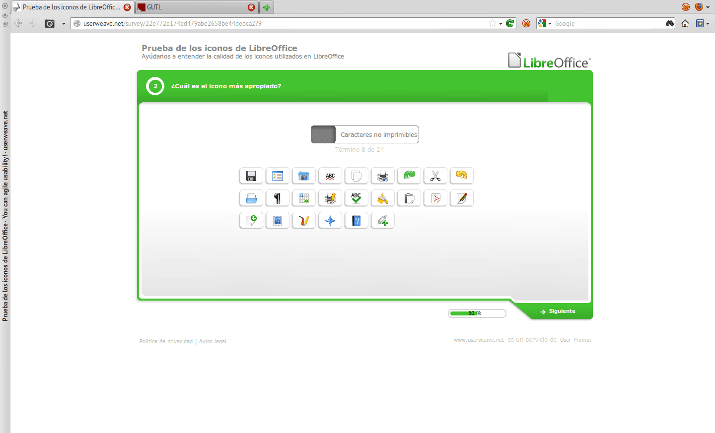
Well, it was not precisely to give us options but to know if we identified the icons by themselves and the truth is that I got lost in one 3 or 4 and also I put the same icon for different things like 2 or 3 times so the icons are not very intuitive to say.
The icon choice proposal is not good. I thought that it would be icon packs, we would choose one / s and the most voted would remain, but no ... selecting the icon for the function is absurd since that is standardized, so to speak.
Greetings.
The icon that I think they should change is the floppy disk that they use to save, because the new generations are totally unaware of it.
Not long ago, a guy asked me how to save his work and I told him, click on the "disk" icon, after a while he asked me again and I answered, click on the disk icon. I wonder what is the floppy disk icon?
I just thought of that icon. The floppy disk is no longer representative. The other thing I noticed from the survey is that there are no options. That is, they should put several icons, for example, PASTE and then you choose the one you like the most. As it is, it seems more like a game of hitting.
At the end of the test the icons ask your age, they take that aspect into account.
Yes, but what good is it. For example, what options other than floppy could be used to "Save file"? There was only one icon that was the answer.
In the test it indicates that if you cannot find an icon to, for example, "save", hit the next one and do not choose any. In that case, the data will show that, for example, those under 20 years of age do not identify the floppy disk as a save icon, that would lead to a redesign of the icon I suppose.
I no longer have respect for what made us happy
HAPPY???
Now that I think about it I hated floppy disks, they always lost the format and I lost EVERYTHING.
ERASE THAT ICON !!!!!!!
How good that LibreOffice takes into account the opinion of users, it will surely be very nice ...
Ridiculous the survey in my opinion ... ¬_¬
Rare survey in my opinion. In the third round I gave up. Reading the post I thought that the user could select one icon pack from among several.
The same thing happened to me, I thought we could select another icon pack or something like that. It seemed weird to me too, but I completed it anyway.
They had already done a survey to select the LibreOffice 3.6 home screen if I remember correctly, it will not be a big deal but I do not see it in vain.
Idem.
But hey ... eaa !! Oxygen is going to look great in KDE SC 😀
We are two ¬ ¬ I say that they should use the Faenza and Faenza Darkest respectively, depending on the theme. Or better, take the gtk / qt theme.
Well, me too. It seemed ridiculous, since only the LibreOffice icons for KDE appeared ……. No icons or new ideas for LibreOffice are shown, there are a lot of artists who have created icons for LibreOfice ……
I'm already getting used to using Calligra words, which is not as powerful as libre office but for what I do, it is more than enough. I do not use libre office as chakra always fails or is missing something.
It's good that you're using a suite as interesting as Calligra, I'm also curious to try it
I also thought that they would give to choose between several icons for a function, but it seems to me that it is the game of guess the icon of the function.
Regarding the comments of the "old" icon of the floppy disk it is possible that they are right and that it should be updated by the icon of a removable "media" with the usb logo.
Maybe that way it looks better.
I really liked participating, it is not a vote to choose which icon is more "cute", it is a true usability test that will serve as the basis for the UI design. Hopefully more free software projects will include users in this type of testing, is to get involved a little in development, but only as a guinea pig 🙂
To me it seemed more like a psychometric test to see if you related well the images with the letters, since to make a selection of designs you need more options in images for an action, in addition to the last one I need to put Linux (Xfce) = P
I hope this survey works for these guys who are doing a great job with the offimatic suite, I just installed the latest version on windows (in the office, don't think bad) and it doesn't ask MS Office 2010 for anything.
The icons can be changed…. and you can elaborate a theme yourself. I now have elementary icons. The problem is not the icons although already put…. You could look for more neutral ones, which are independent of the distro in which it is installed (gnome 3 symbolic type) or make new gnome / tango / elementary + KDE types, as more representative environments. But what you have to try to change is the environment of bars and the arrangement of the icons for something more modern (larger icons, improve the drop-downs, etc). Time to time. So far it seems that they have tried to improve performance and I can say that it is noticeable how quickly it opens compared to two or three versions behind.
Note to administrators: "Edit comment" would not be a good idea. Sometimes I miss mistakes and then I can't do anything to correct it.
There is something evident, the average age of the team of designers is over 40 years ... In any case, my recommendation would be that before worrying so much about the design of the icons, they take care of polishing the operation of the package, so that, for example , cutting from a web page and pasting into a document does not become Chinese torture.
CONGRATULATIONS to LibreOffice for taking the COMMUNITY into account.
I WISH they should do and follow LibreOffice's lead
so if it would be A COMMUNITY
I got to the END !!!!
And they thanked me !!!
It feels great to collaborate with OpenSurce!
(If I used MinosoftOfise or even tried to think of helping)
I always use the "Tango" icons if you put the icons that are usually installed on LibreOffice (KDE), since some of them I don't even know where to get them.
They told me that they will continue with the traditional graphical interface… .. I hope they can polish the graphical interface especially for GNU / LINUX… the Borland c ++ VCL Libraries with their widgets are not very aesthetic the truth… and that they are designed for WINDOWS… ..you will have to read the LOTUS code to fix the compatibility of some widgets. So they look better on GNU / LINUX.