
Updated 18/10/14
One of the main disadvantages of the systems KISS as Arch Linux It is derived precisely from its own nature, since as we do not have anything standard configured we have to take care of adjusting every detail.
An example of this is the one related to fonts, and is that after installing Arch you've probably noticed that these don't look too good (not to mention that some look horrendous); unlike other ready-to-use systems like Ubuntu where they look pretty from the start.
Next I will show how I did to solve this fault.
- The first step will be to remove the sources of Xorg in case of having them installed:
# pacman -Rns xorg-fonts-75dpi xorg-fonts-100dpi - Then we will install these font packages from the official repositories:
# pacman -S artwiz-fonts ttf-bitstream-vera ttf-cheapskate - Now we are going to uninstall the default packages for displaying fonts:
# pacman -Rdd fontconfig freetype2 - And we will replace them with packages of Ubuntu y Microsoft (haters, abstain) found in AUR. Assuming you use Yogurt the command would be this:
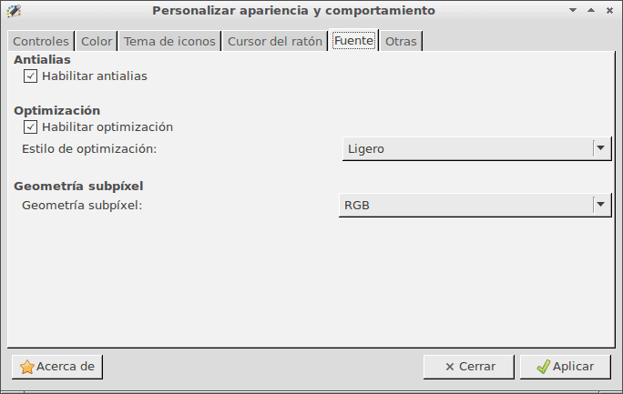
$ yaourt -S fontconfig-ubuntu freetype2-ubuntu ttf-ms-fonts - We are almost done, now we just need to activate the Anti-alias, set an optimization style light and define the sub-pixel geometry as RGB. We can do all this by choosing one of the following three methods:
- Using the font customization application corresponding to your desktop (GNOME, KDE, Xfce y LXDE each bring their own).
- Installing LXAppearance, the customization app LXDE (
# pacman -S lxappearance), and adjusting the options in this way (click on the image to enlarge):
- Through a text file. Create in your user folder a file called
.fonts.confand paste the code that you will find in this link.
- Now we clear the font cache:
# fc-cache -f -v - And now it only remains to exit the session and re-enter to apply the changes.
If everything has gone well, we will go from something like this:

To something like this:

I hope this helps you, and if you know of any other method, do not hesitate to share it in the comments. 🙂
The guy who posted that message is a care troll ttitiitiriririr xd
LOL!!!
There is each ...
Tip: when you approve my articles don't use the visual editor; I always write them from the HTML view and if they open them from the visual editor they can be distorted as it happened in this case.
It is that by default the visual editor opens 🙁
Well, I'll also have to review them in that editor, although I've always had a mania for it.
Ready, corrected the distortion that the article had. 🙂
The truth is that the question in the screenshot is ...
thanks for the info! the truth is that I don't like Arch fonts very much, now I change them to see how 🙂
PS: the user-agent does not work for me in arch, and if I configure it by following its "tips" I cannot enter google + because my browser is "too old" hahaha.
About the last thing you say, what if you try adding WebKit to the UserAgent?
add it at the end you say? if so, it still doesn't work for me g + ... I'll hit what I have in general. useragent.override: Mozilla / 5.0 (X11; Linux x86_64) Arch Linux Firefox / 11.0 WebKit
PS (for the one below): I only have a locale (which I just changed to es-ES) and a boolean, so I can get little information ...
PD2: if I only put Arch Linux and do not specify anything else, google comes up in vintage mode 😉
PD3: is there no way for those fields to generate themselves? because if I update the version I will not be aware of changing the number ...
SOLVED, I was missing data that I got thanks to whatsmyuseragent.com and adding the word Arch I get my distro to look here 🙂 it looks like this: Mozilla / 5.0 (X11; Arch Linux x86_64; rv: 11.0) Gecko / 20100101 Firefox / 11.0
Sorry for the inconvenience.
PS: still there is no other way to do it without adding override?
Use the information from about: and just add / replace the one from arch
By the way, in the end I ended up installing and configuring the sources following the wiki (quite similar to this post) and a bit by intuition, even though I installed the ones from Microsoft Following the advice in the post (ttf-ms-fonts package), firefox didn't look the way I wanted it 🙂 although I notice that the gnome-terminal was ugly and I had to change the monospace fonts.
Good tutorial. Successfully tested. Thank you
Hmm, I am using the Android 4.0 Roboto source for almost everything and I have no complaints ...
I have to try them, but since I use Droid Sans, I left Ubuntu font aside.
You should try the font: CartoGhotic std, it fits perfectly in any environment and in my view, it distributes the space better than Droid
It can be downloaded from fontsquirrel
Hello
I see that they use the Ubuntu font rendering package. Add that there is an alternative option which is to use the infinality package, in case someone wants to try it.
I don't know that one but thanks for the recommendation. 🙂
I have also used the infinality package and can say that it gives better results than using the Ubuntu modification.
With infinality you can choose between several rendering modes: Generic Linux, Ubuntu, Windows 98 / Vista / 7, Classic Mac and OSX, plus it is cross-platform and does not delay building the package as it happens with Ubuntu rendering.
To install it in Arch you just have to do:
yaourt -S fontconfig-infinality freetype2-infinalityWhat is infinatily itself?
It is a patch for fontconfig, as they say on their website: provide a patch for a "nice" font rendering on any operating system http://www.infinality.net/blog/infinality-freetype-patches/
Ohh !! Thanks for the info. Let me see if I give it a try. Will it further improve font rendering on my Xfce?
I use it in my ArchLinux + Xfce combination and it looks great, next to the CartoGhotic std source.
Infinality makes programs like LibreOffice, Opera, Firefox and Qt applications look amazing, very smooth, I hadn't noticed either, but it has a rendering mode called "Chrome OS", I use "OSX", and it goes Excellent
Yahoo answers has to be the place with the most trolls per square meter, second only to youtube comments.
Thank you very much friend. It works perfect in Chakra and a pity that you like the Real hahaha ... now they are at 4. Greetings
Madridista I was born and Madridista I have to die. Real Madrid, pride and glory forever. xD
+100!!!! 😀 😀
I was only born an anti-Barcelona player xD, I don't like Madrid too much, but only that one can stand up to him, Forza Lazio and Visca Espanyol eheh
It has worked for me except that in the terminal the letter joins me (if I write «mo» the «o» appears almost inside the «m»)
Otherwise thank you !!
If you use GNOME Terminal you should probably change the fonts as Woqer said a few comments above. For my part I use LXTerminal and I have not noticed anything abnormal.
Right, I hadn't read it, thank you.
Everything worked very well for me
Personally the first thing I do in any installation is to disable antialiasing and put hinting to a minimum, I don't know who is the genius who invented antialiasing for system fonts but it is certainly a great HDP.
Note: although the font is a bit large, I stay with the first example my whole life than with the option you propose, frankly unreadable to spend long hours in front of the screen.
And don't you see some sites distorted? For example, don't you see how the tabs at the top of the sidebar of this blog do not fit and one goes down?
Never, _NEVER_ had problems with fonts in Arch, * NEVER *.
Thank you very much, it improves the presentation a lot. I was already getting impatient about this aspect.
Same idea but for Debian! ???
Failed to install "libxft-ubuntu". Any clues on how to fix this?
It seems that packages ending in * -ubuntu no longer exist. Look for them in the AUR to see if they are there.
Hello, I come from the future.
3 years after the post I came to comment that it is the only thing that has helped me to improve the horrible rendering of fonts in my Antergos XFCE, working perfectly
With the infinility everything was still just as horrible.
Thank you very much, Manolillo.
Excellent, only this has served me in Arch + gnome, thank you very much, greetings!
2016 and continue to unite for arch thanks for this great contribution
regards