
The guide that I show below is an adaptation of the original that we can read here, where it shows us how to create packages (.deb) that will allow us to improve the rendering and appearance of the sources in Debian GNU / Linux.
Installing the dependencies
We open a terminal and put:
$ sudo aptitude install build-essential docbook-to-man libx11-dev x11proto-core-dev libz-dev quilt debhelper pdebuild-cross
This will install a lot of packages, but nothing, when we finish we can uninstall them again. Once all are installed, we install git-core:
$ sudo aptitude install git-core
When we finish with all this, in the terminal we put:
$ git clone https://github.com/chenxiaolong/Debian-Packages.git $ cd Debian-Packages / $ cd freetype-infinality / $ dpkg-checkbuilddeps $ cd ../fontconfig-infinality/ $ dpkg-checkbuilddeps
What we do with dpkg-checkbuilddeps is to make sure that we do not lack any dependency. Well, if everything is normal, we go to the next step:
cd ../freetype-infinality/ ./build.sh cd ../fontconfig-infinality/ ./build.sh
These scripts download packages of no more than 2MB and do not take long to run. When they finish, we will have created the necessary .debs, which we install with:
cd .. sudo dpkg -i freetype-infinality / *. deb fontconfig-infinality / *. deb
And that's it. We restart and when we access again we will see the changes.
Sadly I didn't take screenshots before doing this so I can't show the differences, but trust me, Chromium fonts that are always a mess now look a lot prettier.
For whoever uses Debian Wheezy 64 Bit and do not want to spend all this work, I leave mine .debs 😛
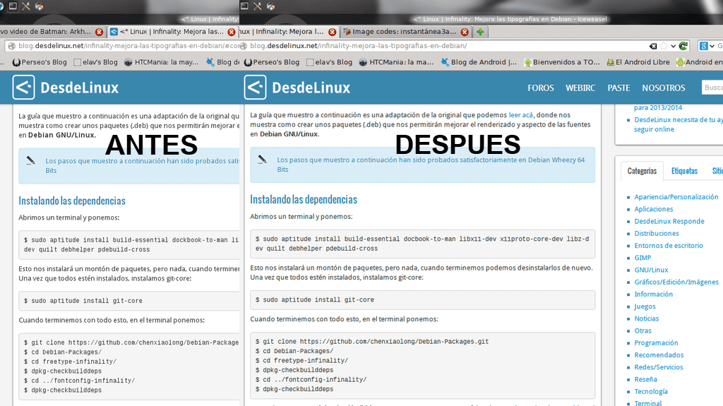
Update: Thanks to elendilnarsil we can see a Before and After:
very good, but no before and after screenshots of the sources?
Unfortunately not .. Anyway if elendilnarsil does everything well, we can use your example in the post .. Right elendilnarsil?
XDD, so far I realize the comment. Of course!
THANK YOU GENIUSES !!!!!!
Hi, I wanted to know if the (obviously compressed) Debian-Packages folder can be offered for download because some of us can't access a git repository behind a proxy and we don't work with 64 bits. Thanks in advance. Regards.
Right now I am somewhat complicated, but later I will upload the folder or if I can, I will send it to the email address you used to comment.
Testing, I will comment and upload images.
He gave me a warning and did not let me continue: "dpkg-checkbuilddeps: build dependencies not satisfied: dockbook-to-man"
I just went through the installation process and that package (docbook-to-man) is missing.
My mistake. It is that I copied it wrong in the article, if it is, but badly written .. Now I fix it. The package is docbook-to-man.
Download your debs and the truth is that the sources are better, although from the beginning I had to reconfigure. Now everything perfect and 100
How did you reconfigure?
In the Kde system preferences, because it looked a little weird
Very well,
Before: http://postimg.org/image/7ko2kkh5b/
After: http://postimg.org/image/a39rl92vj/
There is a better definition of the sources, and they feel more saturated. Although I had to reboot the system a second time, because it got so slow.
By the way Elav, what of all that can be uninstalled?
Well I suppose that deleting the same .deb that you put the thing back to its place 😀
Will it be the Debian-Packages folder, located in the Personal folder?
Ah, well once you have created your .deb, you can delete the whole folder if you want .. That does not determine anything.
Done.
I just added a .font file (or something like that, now I'm with the laptop with windows and I can't check it) in the home directory and it improves a lot, it looks as good as in distributions like ubuntu. And without installing anything, just a text file
elav now you say that you do not notice a difference because with this infinality it would be the last straw.
http://www.infinality.net/blog/infinality-repository/ <- the repo for my Fedorian friends
you are thanked, because pure .deb .deb .deb and more .deb.
in Arch and derivatives there is also: http://deblinux.wordpress.com/2013/03/02/tip-mejora-y-mucho-el-renderizado-de-fuentes-en-manjaro-linux/
fedora:
su -

rpm -Uvh http://www.infinality.net/fedora/linux/infinality-repo-1.0-1.noarch.rpm

yum install freetype-infinality fontconfig-infinality
regards
Good tip, but I prefer the fonts that I have by default (at least they are better than the TrueType that Windows has and they are not even readable).
Installed the .deb (yes I'm lazy XD). It really looks better, thanks for the input.
I have tested it on Debian Wheezy x86 on a laptop with a small screen of a few inches, and the truth is that it looked worse with the infinality sources than with the ones that come by default, so I had to uninstall the packages so that everything would return to normal. I guess it depends on the equipment in question whether they look better or worse.
Salu2.
Hello, what you doing
I am commenting from windows 7 and my rendering is very good 😛
hehe! .. Lol .. Ummm .. I would like the Apple font more or the Ubuntu People font 😛
Infinality is the best.
Curious thing that I realized until today: the LibreOffice menu bar appeared huge. But correcting it was simple.
By the way Elav, I imagine that due to the changes they are making in the blog, the desktop is no longer identified.
I hadn't even noticed. I'll have to ask KZKG ^ Gaara.
A radical change, it looks much better now. many thanks.
In my opinion, at least on Debian, it is not necessary. I have a full tutorial on the subject and it achieves the same without adding external packages or repos. Especially if it is Chrome / ium.
http://crunchbang.org/forums/viewtopic.php?pid=196047
In debian I don't think it is necessary to apply this tip, the one that comes by default doesn't bother me. In archlinux if I put my hand to the sources ..
Good date..
regards
I agree with you, although Arch should have an installer similar to the one that OpenBSD has (so far, the best assisted installer I've used so far).
[Off Topic]
Iceweasel users noticing that the easter egg "about: iceweasel" is no longer found in 3, 2, 1 ...
[/ Off Topic]
let's try it, see how they look… .thank you in advance
I used it in Slackware ... the letters just look exquisite.
XFCE is horrible, but with a couple of hours of moving it around and adding Infinality to it, we can achieve something decent, like this:
https://lh4.googleusercontent.com/-vqv1TlkQonQ/UcDw-Btr06I/AAAAAAAAAWM/SqKwS57zL6c/w1366-h768-no/Slackware_XFCE_Cairodock_Infinality.png