Looking to customize my brand new KDETired of the usual icon pack, I found this pack in KDE-Look, and they seemed very complete to share with you ...

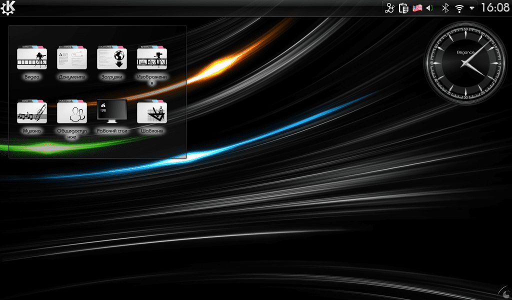
And so the desktop was:
The set contains:
- Shares - 593
- Animation - 70
- Apps - 766
- Categories - 118
- Devices - 231
- Emblems - 109
- Mime types - 509
- Places - 206
- State - 577
- Stock - 4.
Total: 3 icons.
Enjoy them and happy tunning xD
They look good, although I'm not a fan of kde icons (they all look horrible to me) I'm going to give it a try. Thanks for sharing
I like everything except the wrinkled sheets with the MIME, they would have been infinitely better with a more traditional design.
Honestly: I did not like them: / They look like the type of icons that I placed in my Windows ...
Am I the only one who hates the icon of "the little house"? hehe ..
The truth is that I did not change the nitrux OS icons for anything
They look very good. Although after trying and testing I opted for gnome 3 and Fedora. I'm very happy.
Well, I just installed the Nitrux icons in my chakra and they are fantastic, they look better than these from the post.
No desire to offend ... I don't like the one with the folders they look good but the others ... well ... 😀
On tastes ... 😀 is one more option in icons, I do not pretend that everyone likes it, I just share them and now, leaving the usual icon packs.
1s
I knew them, they are quite good, but I still prefer KFaenza. I've been using them for a long time and they still haven't tired me 😉
A greeting!
Did you have the desk with Russian fonts? xD
What is the Plasma theme of the image? Oxygen?
I continue with my life tango. Of course, all in svg quality… .. and that nothing lacks an icon. Simplicity and uniformity throughout the system + programs (suitable themes). I hate that anything "sings" because it has different icons
I agree that the KDE icons are quite ugly although I quite like the ones in the notification areas.