Several months ago Linux announced plans to update its famous logo with a more modern design and although I show some advances, it was not put more about it, until now.
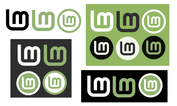
Work to revamp the Linux Mint logo continues and the designers comment that there are several problems and inconsistencies with the original logo margin that have been fixed in this new logo, the latest iterations of it can be seen below.

"We are moving to an LM shape that looks like the original, but without the errors, without the space between the two letters or the sheet around it,”As mentioned by the project manager Clement Lefebvre in his latest update.
Removing the sheet is by far the most controversial redesign proposal. Many users believe that the leaf is what gives the identity to the Linux Mint logo.
But keeping the sheet in the new design takes away all purpose and makes the logo more difficult to place in places like the system interface or the start menu. So that the main idea is to reduce the logo to only the letters L and M.
Either way, and however the logo ends, it must be remembered that Linux Mint will remain the same and will not have changes in its operation.
Excuse me if it is not the ideal place since there is no forum and I want to ask a publicly free question:
What is the relationship with Linux Addicts? It has the same owner, the same editors, the same theme, even the same staff ...
I am a self taught graphic designer and in what I have learned so far, sometimes less is more. The logos must be simple, clear and that they can be used in any format (web, printing, embroidery, icons, etc.). They are on the right track ... the initials remain and their corporate colors as well. Even if the page is removed, it is still clear that one refers to Linux Mint.