A configuration or customization on my Desktop has never taken me so long, and I really plan to leave it like that for a long time. Now I only changed the theme of the windows, but the rest remains the same. What do you think?


Configuration.
Now, how did I manage to have this appearance? Well, very simple, let's see part by part. From the outset I must say that everything you see on the screen does not carry anything extra that it does not have Xfce.
Gtk Theme, Icon Theme and Window Theme (Xfwm)
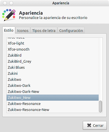
The theme I am using is zukitwo. We open a console and put:
$ mkdir ZukiTwo

$ cd ZukiTwo

$ wget http://www.deviantart.com/download/203936861/zukitwo_by_lassekongo83-d3df2ot.zip

$ unzip zukitwo_by_lassekongo83-d3df2ot.zip

$ sudo mv Zukitwo /usr/share/themes/

$ cd .. && rm -R ZukiTwo
With this we copy the theme folder to / usr / share / themes / and we just have to select it. Let's go to Menu »Settings» Appearance and we select it.
We return to the terminal and put:
$ mkdir Elementary

$ cd Elementary

$ wget http://fc07.deviantart.net/fs71/f/2010/296/1/a/elementary_icons_by_danrabbit-d12yjq7.zip

$ unzip
elementary_icons_by_danrabbit-d12yjq7.zip
$ cd icons/
$ tar -xvf elementary.tar.gz
$ sudo mv elementary /usr/share/icons/
$ cd && rm -R Elementary
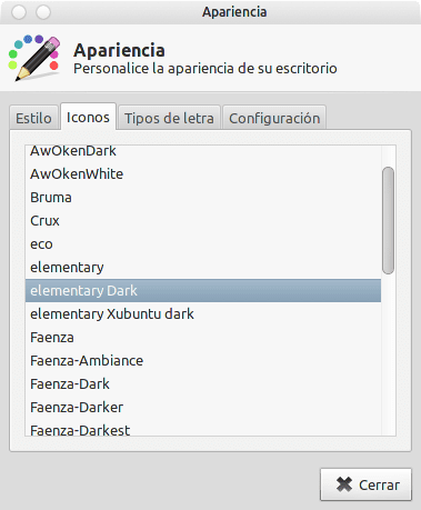
Then we go to the icons tab and select Elementary Dark:
Finally we have to select the decoration of the window, so we go to Menu »Settings» Window Manager.
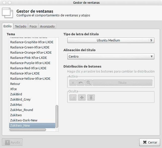
It should come out by default zukitwo, what happens that I renamed the folder to Zukitwo_New because I was doing some experiments 😀
Top Panel.
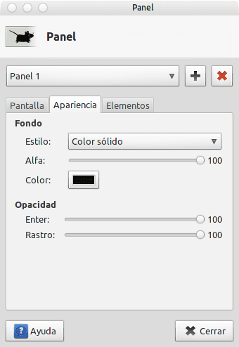
Both the top and bottom panels have a solid background color. To do this we right click on it panel »Panel» Panel Preferences »Appearance and we leave it this way:
The arrangement of the Elements in the upper panel is as follows:
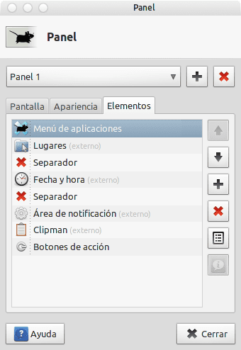
In the case of separators, we must double click on them and mark the option: Expand.
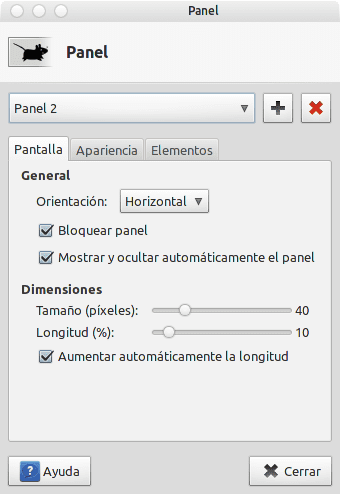
Lower Panel
In the case of the bottom panel I use as Dock, the configuration has been the same in terms of Appearance, but not in the panel options themselves, which should look like this:
And the Elements should look like this:
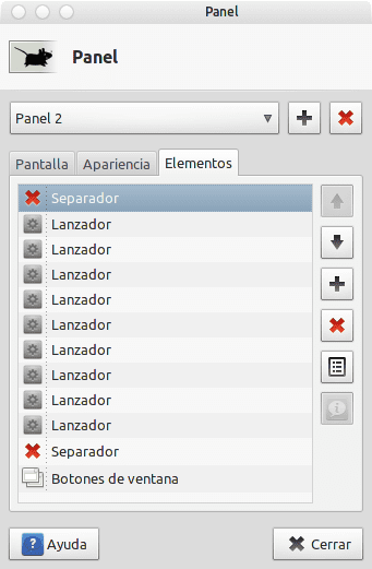
If you notice all the icons on the left are nothing more than launchers and the Window List right without option: Show button labels, so that only the icon appears. Setting up a launcher is not complicated at all, but if you wish, I will make another post to show the process. 😀
All that remains is to choose a good wallpaper and walk ndo
Well, it seems very good to me, but for my taste the upper bar and the lower launcher would give it a little transparency and not be so black, but, you are moving forward, hahahaha,
don't show you, it's just kidding
aya the folders on the desktop or remove them or delete the text box
Hahahaha nothing happens, I do not get angry hahaha. Thanks for the suggestion. The folders on the desktop are by chance, I never use them 😀
ok, let's see when you make the corrections put a screenshot, and incidentally the two icons on the right of the launcher below put them the same as the others, at least, hahaha
and you will say; This guy's got my cocks up, huh? hahaha
I already updated the post with the capture without the icons. Now, about the color of the launcher icons, things get complicated, because the ones on the right are the application icons (according to Elementary) and the ones on the left are icons that I took from AwOken. If I put the same theme for everything, then I could not differentiate between the launcher and the list of open applications 😛
It is strange that it does not have any distinctive, example, box or dot below, etc, for open applications.
well you can always put a dock of the many there are,
all the best
That is one of the "errors" of your configuration (I enclose the errors because here everyone leaves the desktop as they please). But since everything has a strong air to Mac and you go minimalist plan, why not use the most intelligent element of the Mac desktop, a dock? Launchers on the one hand and open applications on the other is a waste of space, it can become confusing and the aesthetic with the icon theme you have chosen does not look very good.
But that's just my opinion (I also think it's a waste of screen space to use two bars when everything fits into one, and there are surely many designers who will disagree with me).
A greeting!
I accept the criticism willingly. At first I don't like "Docks", so for me it is quite a novelty to have a panel fulfilling this function. I share the idea that I could use one of many docks that exist for GNU / Linux, but it is extra consumption that I do not need. However, I am going to do the test and leave the desktop as it is afterwards 😀
Of all the available docks, Cairo-Dock and Docky are my favorites. The second one I don't use as it has too many Mono dependencies and Cairo-Dock is very light. I seriously tried to use it as you can see here, but that's it, for many topics that I have put on it, none convinced me .. I'm going back to the panel for now .. I need to try AWN… =)
Uppss I forgot to put the links. By the way, I just tried AWN and I keep this one. Here are both screenshots:
With Cairo-Dock
With AWN
If you don't want to spend extra resources, there is plenty of dock, it's true. So you have to choose between usability and performance. But I already tell you that if you get used to using the dock, you will not want to go back to the old method.
What's more, if you configure AWN well, you can do without the top panel and gain space.
Well, for now I'm using AWN, which from time to time closes (I don't know why) but it's the one that best suits what I want 😀
He is sober. I like it. 🙂
I've been wanting to try a recent version of XFCE for a while (I haven't used it for years, mainly because of Thunar, which I never liked). Probably as soon as I free up some space in the house I will put it to test and thus alternate with the LMDE Gnome, which is what I use at work. If there was a Mint-menu for XFCE ...
You can use Marlin or the Nautilus itself 😀
Thanks friend, I already have another great theme for my Lap + Sabayon + Xfce XD.
Do you already have Xfce installed in Sabayon? Tell me, how are you doing * - *
Hello, I would like to know how to assign multimedia keys (play / pause, next, prev) in xfce: D. That is the only reason why I still use gnome3, to be able to assign those functions to the keys that I want.
Is it my idea or is there a public tribute to MacOSX on your desk? ... the window buttons on the left, a menu and task bar at the top and a dock at the bottom ...
ahahahahahahahahahahaha 😀
Ha! It is not a tribute to OS X, although no one is a secret (well I have said it publicly) I like his appearance. The buttons on the left, from which Ubuntu It implemented them for the first time, I started using them like this and I got used to it right away. I don't know why they are more comfortable for me that way. I have always said that if Apple (people with a lot of creativity and excellent design concepts) have always used it like that, for some reason it will be and not out of sheer whim.
I'm not saying it in a bad mood, on the contrary, just like you do the aesthetics and functionality of MacOSX I think the best. In fact my desktop configuration is also in the style MacOSX but without reaching the minimalism of yours.
I know you don't say it with bad vibes ^^ because as you say, I know from the screenshots on your desktop that you also like the Mac OS X style =)
I think it is because of the following:
On Mac the buttons are in the following order: Close, minimize and maximize.
If what you are going to do is close the window and fail, the last thing you want is to see that the window is maximized
I have it in that same order. But I think there is a reason beyond what you say. For example, for me it is more comfortable to close a window and have the Applications Menu very close. The same thing that I imagine happens with the OS X menu bar ..
The reason why the buttons are more comfortable on the left side is that since most use the mouse with the right hand, the movement that goes from the upper left corner to the center (place that is usually the work area) is easier to do than the one that goes from the center to the upper right corner. in this way there is a line that goes from the upper left corner to the lower right corner, and widens in the center, and marks, for the convenience of handling the mouse, the workflow. that is why also the menu in mac is in the upper left corner.
Regarding to using a dock or not, if your pc has enough resources, you should take advantage of them using programs that give you functionality. remember that having ram memory and not using it is like not having it, and instead spending it on certain programs with which you can access what you are looking for faster, it is as if that wasted ram you capitalize on speed
Thanks for the clarification on cursor movement. I knew there was a logical explanation. What you say is really true 😀
Another thing: I know that on your desktop you always feel at home, and also that monochrome icons are very aesthetic. but I am sure that using full color icons instead of monochrome for applications will save you mental work (even if it is imperceptible, at the end of the day it shows) in knowing which icon is for which application.
in gnome 2 there was a panel-applet that showed the window buttons, as well as the title (which unity now does) of form q when you maximize, the window titlebar disappears and remains as embedded in the panel. That was (and I find it, since I use unity) very comfortable since to close a window the mouse movement was easier to do. as far as gnome 2 panel applets could be used in XFCE panels. I say this because I think it would be very useful for your desktop
Thanks for your suggestion manuhank, in fact after the advice Metalbyte gave me I replaced the panel with AWN 😀
[troll mode on]
Osx looks better
[troll mode]
xD
* off
It is quite good, here everyone has their own tastes and it is normal that they adapt their environment to their needs. I do not think that it is intended to satisfy all observers, but rather the user who uses it every day, and who has made these modifications perfectly knowing what he wanted or was looking for.
Personally, I don't like MAC-style docks, I prefer panels and the classic task manager; it is infinitely faster to navigate open windows, although I respect the decisions of others.
I leave you a screenshot of my desktop from last week (today is already very different):
Capture
A greeting.
Each person has their own tastes and personalizes their workspace based on them; I do not think that it seeks to satisfy the observers, only the user who has carried out these modifications perfectly knowing what he was doing.
Personally, the MAC aesthetics do not throw me much, and I hate docks - the classic task manager seems more practical and faster. Of course I am a somewhat atypical KDE user, looking for minimalism in an overloaded environment, haha.
Regardless, last week I decorated my Arch with a hybrid MAC style, let's see what you think:
https://sites.google.com/site/rsvnna/baul/instant%C3%A1nea93.png?attredirects=0
A fool.
*A greeting.
it is very beautiful and elegant and I love the colors,
one thing ; as it is put on the left side of the window, places information?
is that I can not find it
ok, I know how it is, greetings
In fact, you have probably already seen this capture in the EOL thread "This is GNU / Linux", because your name sounds familiar to me, haha - although there I use the name WolfAbstract "- ..
Good question. I never normally use these types of keys, however we could investigate if Xfce provides this option (I'm pretty sure it does).
Hey, even if I didn't you could assign those keys to specific functions 😛 But I'm pretty sure the xfce4-volumed sets that automatically ...
Indeed, I had already seen it, but did not remember where, a greeting
Excellent, master 😉
How beautiful, the truth is that she is a cool girl.
How did you change the buttons to the left with Zukitwo?
Greetings Matias:
It is true that I had to change it manually -.- 'because that option in Zukitwo is blocked for Xfwm. Right now I make a post so that everyone knows how to do it.
Great, thank you!
Here's mine hehehe! I am a newbie .. I wait for suggestions, you criticize whatever!
http://a7.sphotos.ak.fbcdn.net/hphotos-ak-ash3/s720x720/535909_411217498904589_100000490276661_1574980_528837154_n.jpg
If you want you can share it in the post of our forum 😀
http://foro.desdelinux.net/viewtopic.php?id=35