Greetings to all .. We want to continue improving, we want to set our own style and that is why we are working hard on the new theme presented a few days ago.
As I told you at the time, the topic was not finished, rather it would be subject to visual changes constantly looking for a better user experience. But (yes, there is always a but), the more beautiful we want the theme to be, with effects and others, the heavier it becomes.
If it were up to me DesdeLinux It would have a flat design, simple, without so much ornament or images, without JS code or things like that, but the rest of my colleagues are of those who think that things come first through the eyes, so I have no other option 😀
We are working tirelessly to correct any bugs that have come up and improve the performance of the site, but we are not experts. We are making the best of our experience and knowledge to optimize everything as much as possible. Once I have said this, well we move on to the news.
New design for the main page
This change is experimental, but it obeys the idea that what the user needs to find in our blog is information, and therefore, the main thing is to highlight the articles.

Now the layout has 3 columns by default (we are very sorry for those users who hate the new Google Plus interface), the sidebar disappearing from view.
But be careful, the information contained in the right panel of the blog has not disappeared, but we have hidden it in 4 buttons:

It is good to note that the button with information has been added for anyone who wants to make monetary donations (or otherwise) for the blog.
By clicking on any of them, a Modal dialog will be displayed, highlighting the information we want to see:
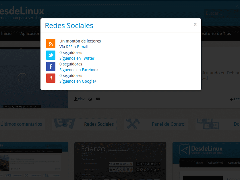
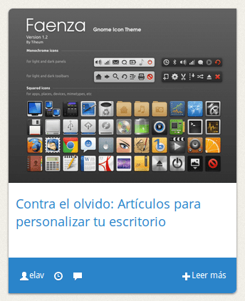
We have also modified the Random Items (aka Recommended), adapting the layout to the new way posts are displayed on the main page:

Following the advice and suggestions of some users, we have removed the excerpt with the text of the post. Now we only have the featured image and its title:
Under the hood we have made some changes to the code, as well as the format of some images to reduce their weight.
An image with a 4: 3 ratio, being a capture there is no other than cropping the image ...
Anyway I like how the blog is looking
It is recommended. Let's see, in theory you upload a large image and WordPress cuts it, it's just a matter of testing. What if NEVER should happen, is that the image is smaller than 320 × 245.
I like the design quite clean and as I said before, the color palette is very good and pleasing to the eye.
Thanks for the comment 😉
The truth is that it works excellent, the previous design did not look good on my netbook. Nice job.
Great! I like that you like it 😀
great ! I loved the changes and the new design! keep in that way !!!
Thanks ^ _ ^
It has improved a lot and full screen looks like vice. When resizing the window, the three post columns are slightly misaligned with respect to the menu and the highlighted news. Sure it can be easily readjusted.
Yes, this happens because we only adjust the theme to specific screen resolutions. This is something that can be solved but it is very cumbersome, as it takes time and constant testing. We will be working on it anyway.
Thanks for the comment.
I recommend this page with tips to optimize your website http://browserdiet.com/es/
Very good, although I would not have hidden the social networks behind a button, it is much better that they are all accessible to a single click.
They are actually hidden only from view .. to the robot if they are .. 😀
Well, it doesn't look bad at all, I've already tested it on several different resolution devices and it adjusts quite well, and the animations run at a decent speed. Although I find it somewhat strange as seen on my Tablet, 1280 × 800 resolution (more or less the same case horizontally and vertically, space is not used well): http://imagebin.org/265253.
For the rest, I like it 🙂
Hmm. Thanks for the screenshot. That is where the problem lies when testing the issue. In my browser with the resolution in 1280 it looks correctly. Crap, and I don't have a tablet to test as God intended.
I like how it looks. And so far I have had no problems.
It looks very good in terms of design. Very clean and tidy, the truth is that it is quite nice and not at all cumbersome... Although the logo of DesdeLinux I think it looks like a chicken I said hahaha…. But very good in general.
The topic is very good, I would just like to tell you that on my laptop the 3 columns are off-center to the left, I send you a screenshot in case it helps you to make any correction.
Keep it up, offering us the best. Big hug
http://img40.imageshack.us/img40/2701/45bs.png
Thanks for the feedback .. What resolution do you have?
1366X768
It is the same resolution that I use and it looks perfectly. Are you sure you have 100% view of the site?
Yes, if you need me to make any other adjustments, let me know. Hug
Elav, I modified the page view several times, finally I left it at 100% and the column view was centered, surely I thought that the view had it at 100% and it was not. I leave you a catch
http://img600.imageshack.us/img600/6590/racf.png
Hug
I was going to report the same, although in my opinion the problem is not that it is off-center but that the design only adapts to lower resolutions and not to higher ones. It would not be bad if the maximum number of columns was not 3 but that as many as the resolution allows, to fill in that enormous blank space.
The problem with that is that, if the resolution supports 6 columns next to each other, then 6 more columns would have to be loaded from the previous posts .. And since we still haven't reached that level of programming 😀
Well, start studying, hahaha.
If you can't, the alternative would be the one that says gossound, and / or make the cards have a flexible width.
BTW, my resolution is 1280 × 800 and I see it the same as in the capture.
On both my recently updated Chromium 28 from the Debian Wheezy security repos and the Chromium 30 I use on Vista (hate me, but I'd rather use Windows Vista a thousand times than Windows 8), the page looks splendidly well done.
@ eliotime3000: I on Chromium on Arch Linux and Chrome on Windows 8 see the columns pulled to the left. In Firefox they look good, centered.
PS Yes, I hate you for using Windows Vista.
This happens when the browser window is not maximized.
This is not like the Google Plus interface, this is a Magazine style layout and that's fine. The Google Plus layout (Pinboard type) has cards of different sizes arranged at different heights, which creates a horrible visual clutter where nothing is understood. Magazine style has equal cards at the same height, like this one. Much more orderly and understandable. So don't worry, I'm canceling my flight to Cuba… for now. 😀
Hahaha .. and I had already bought a pair of machetes .. 😛
I know, and I wanted to release my bazooka; but hey, there will be a next time, when now you do disgrace the design and I must make you a not very cordial visit. 😉
Because of the pinboard thing, I have abandoned my Pinterest profile, since that style really made me dizzy and I rarely use G+ to see what's new on the internet. desdelinux.
Although I would suggest the design of the libreoffice.org home page if you want to adapt it to tablets, it also gives you a feeling of having a menu of Angry Birds levels.
Something that helped me to write was the guide that Elav (I think he wrote) in:
https://blog.desdelinux.net/guia-para-colaboradores-de-desdelinux/
It would be useful if all these data were in a similar updated guide to be easier to write.
I like very much!!
I leave you a capture at 1920 × 1200 at 100% scale
http://i42.tinypic.com/wtepvt.jpg
No, I totally oppose xD I know that my vote does not count at all but it is to open the blog and I see 6 news, in principle I should not need more because the rhythm of creating these news allows you not to need to see more than 6 if you visit this blog daily like me, but just give a little tap to the mouse wheel and see the page numbers to start turning pages ... as there is someone who comes only 2 days a week or even only on Saturdays or has been on vacation, comes to see the news and has to be turning pages for every 6 news ... it will end up to the nose ... not to say that it is ugly that the roulette only serves me to see the footer of the page and the numbers of the pages, and well That happy face that you have put right at the end of the web, I imagine you put it to do some test or something.
Solutions? Well, the best that I see and is more current is that as you go down with the roulette, the new news will appear, not having to be clicking, more and more we have gone from a simple website like the ones you like to something more dynamic, that offers more options and functionalities, but another simpler option would be to simply put 9 or 12 news per page.
And why no one has told you this so far may be because they do not see it as a problem or because it is not so noticeable in "normal" resolutions, although in RafaGCG's photo I think that what I say is beginning to be appreciated a bit , and I have a resolution of 1440p I notice it much more, my screen margin leads to just the line of the page numbers, that is, I see the entire web at a glance, and that without counting the 4k screens that although we seem distant in 3 4 years I think there will be enough and they will be as they are now the 1440p, expensive but with people buying them.
A screenshot please.
Bottom line: liquid width and infinite scrobbling.
I can't understand why they want those mega solutions if all the pages are lowercase, hahaha. Although I imagine that HD movies must look great. 😀
I'll know when I switch laptops. 😛
Cards cannot be flexibly sized, because that means they have to load a larger and larger image and thus may cause the design to break or take longer to load the site.
The cards remind me of the pages that make free themes for WordPress, in addition to giving it a more pleasing theme to the eye and not saturating it more than necessary.
Anyway, the design is relaxing for me and it doesn't bother me at all, having an HP L1706 monitor with a resolution of 1280 * 1024.
Well, here is a screenshot of my PC with Vista showing the site >> http://imgur.com/sraFD2D
I have already answered ... xD I almost forgot about tixD, more than anything I changed because it had a lower resolution and how I saw the Korean monitors that in the end are € 222 + customs well I said ... let's take a risk ... it has not gone bad at all And what it works for me the most is because I am a programmer and by putting the screen vertically I can have many more lines of code on the screen, and horizontally I can have many more things on the screen, although until summer I have been all the time with a laptop 15 ″ FullHD and without complaints but when I returned to the desktop it is already different.
I think that's perfect. Today there are many portable devices with small screens. And myself on the 1920 × 1200 screen I always use it with 120% magnification
http://i43.tinypic.com/wqy713.jpg
With regard to showing 12 news on the cover, I imagine that if they put 6 it is to optimize resources. Hopefully we all support and can hire a machine in conditions, so that the site can fly with the entire community using it.
You are also absolutely right, most people have less than FullHD and have medium equipment, and at the end of the day it does not bother me because I visit it daily, and if it bothers me then I will have to annoy because it is a great blog and I'm not going to stop visiting for a couple of failures 😀 but hey better take into account all the failures and thus know where you can improve when you can
This is in full screen http://i.imgur.com/ZzTa5dJ.jpg I have also removed the Windows bar so that it can be appreciated more although normally I am with the bar but I do not know if others will not have it ..
And this other I just noticed now that it is when you have the explorer only in a piece of the screen. http://i.imgur.com/8PrlbXF.png I think it would be better centered instead of to the left.
Thanks for the feedback .. 😉
The smiley face is added by the JetPack statistics module. It can be hidden with a little CSS if it bothers ...
No, it was just because the little face seemed curious to me and I didn't know what it was due to 😛
Very good changes. It looks great and I really like it. However, there is still some slowness. Especially when loading the site the first time. I tell them because I know they are in tests and they need that feedback.
Keep going 😀
I really like the new design a lot.
I come from let's use linux.
My advice would be to add a text or something to the menu bar for the mobile version, let's say. so the bar is not empty with the icon only.
The rest I really like the design and bootstrap 😛
regards
This change in
Regards!
The design is very good, and the theme has been adapted very well to various browsers.
Interestingly, the font that this page uses is quite similar to Windows' Seoge UI.
Well, we only use Droid Sans and Open Sans .. 😛
Great, on the Netbook Elav looks very good, total use of space, and on the other screen (the 1600 × 900) all things are better accommodated now and the old feeling of voids on the sides is not felt.
P.S; And I say, taking advantage of the remodeling times, when they are going to look at the poor paste !, how ugly it has always been (useful of course) but ugly xD
Excellent Rayonant .. thanks for the feedback.
The loading and speed of the mobile version improved considerably, well done guys 😉
Thanks for the tip 😉
My criticism is from a personal point of view and I hope it is also constructive.
- The main and entry page is like a kind of speed dial, that's good. but the problem is that the illustrative images of the posts are very large .. which forces the reader to have to slide the browser's side scrolling bar to have an overview of all the posts .. .. it would be much more attractive if It could be avoided that, and to be able to see all the entrances without needing to slide the bar ... so with a single click to choose which one interests us the most!
Greetings and keep going!
Thanks for the suggestion. Trust me, this theme will keep evolving and improving. Do not worry.
Juas! and up there they asked just the opposite, more things on the screen and prepare it for 4K resolutions. I think that this width works well, the smaller images for 1920 × 1200 of course not, I already use it with + 120% normally everything. What if it could be good are more rows not 6 news, but if you eat a lot of machine…. Well, little by little.
+1 liquid and very clear design
IMHO, the banner after the header, the one that highlights a past article, is too wide and eats up too much screen (at 1024px)
Sorry I meant too tall, not wide
XDDD buttons do not load on internet explorer
It's what you deserve for using Internet Explorer, hahaha.
Seriously, which buttons?
And now for asking ... xD That the comments be integrated with Disqus that I saw recently in http://www.muylinux.com/ and I found it useful to give My Disqus and see all the new comments and news without having to check some checkboxes for each comment I make or having to receive that information in the email that I do not want because the email is only used for work, for what is good for me to enter to see X news and then see if someone has answered any comment.
PS: If you do not like me to give ideas or so tell me that sometimes I spend talking or make comments that it seems that I undermine the work of what has been done so far and so on, but I would like you to tell me the faults I have and if it is possible solutions so I tend to do that myself.
Thanks for the suggestions. Let's see, in parts:
1. About the comments with Disqus, if I remember correctly, we had already discussed it before. The detail is that with Disqus we lose control over the customization of the comments, and as you can see we have them very personalized, appearing the users differentiated by ranges and that plugin that we like so much that it shows the browser, operating system and desktop of the commentator. With Disqus we could not do any of that, and on the other hand, I cannot think of any advantage that it could offer us that compensates for this loss of control.
2. As for the checkboxes, I suppose you mean the name, email and website fields, but you don't have to fill them out every time you comment, you just have to log in with your blog account and the system automatically fills them in for you . In fact I do not understand what the problem is since this is how you have sent this comment, and in Disqus to comment you also need to fill in fields or log in, so it does not seem to me that there is any difference.
If anything, what the native system does not have is the option to log in with your Twitter or Facebook account, but we have tried that option before and removed it because it had many flaws (DO NOT ask for their return PLEASE: D).
3. If you are receiving spam, before commenting check that the notification fields below the comments form are unmarked, and to cancel the subscriptions that you already have active you will find the option in the same emails.
Thanks again for the feedback, any other complaints or suggestions you have, do not hesitate to expose them, they are all welcome. 🙂
Well, I put it in another article because I hadn't seen this one.
@elav: I don't want to be unpleasant to you, but the truth is that the blog as it is, for me, it looks horrible. I do not like. I think it's good that the articles are like this, at first glance, but the design itself does not look good, rather, I do not see it well.
What specifically do you not like? It doesn't seem to me that much has actually changed ...
I don't like the blog cover. The interior is very good, but the cover is ugly to me, it's like it doesn't convey anything to me. It may be that a two-column style would be better instead of three, and in the space where the third is now, you could put other information related to the blog. Don't get me wrong, at first glance that kind of "preview" of articles is very useful, but visually it doesn't convince me.
Anyway, it's just an opinion.
regards
I think you hit it there. It looks very dull in my opinion. Perhaps with a lighter background color, and something that makes the elements stand out, such as frames or shadows.
I also think the featured article takes up too much space. It eats up around 30% of the screen, and along with the four buttons below it almost takes items out of sight, which are supposed to be the most important thing. You could reduce the width a bit and use that new space to place a panel to one side where the four buttons are grouped, which could have more intense colors, since they are now very pale.
All this together would be a little better, don't you think?
"Affirmative" would say a military friend I have.