![]()
In these last months I have not changed much my desktop environment, basically I change the wallpaper and occasionally change my icon set or pack.
Now I want to talk to you about Potenza, an extremely complete set of icons, that is, it has icons for a lot of applications and views, relatively new and good ... images speak louder than words:
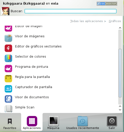
Here are some of the KDE applications menu:
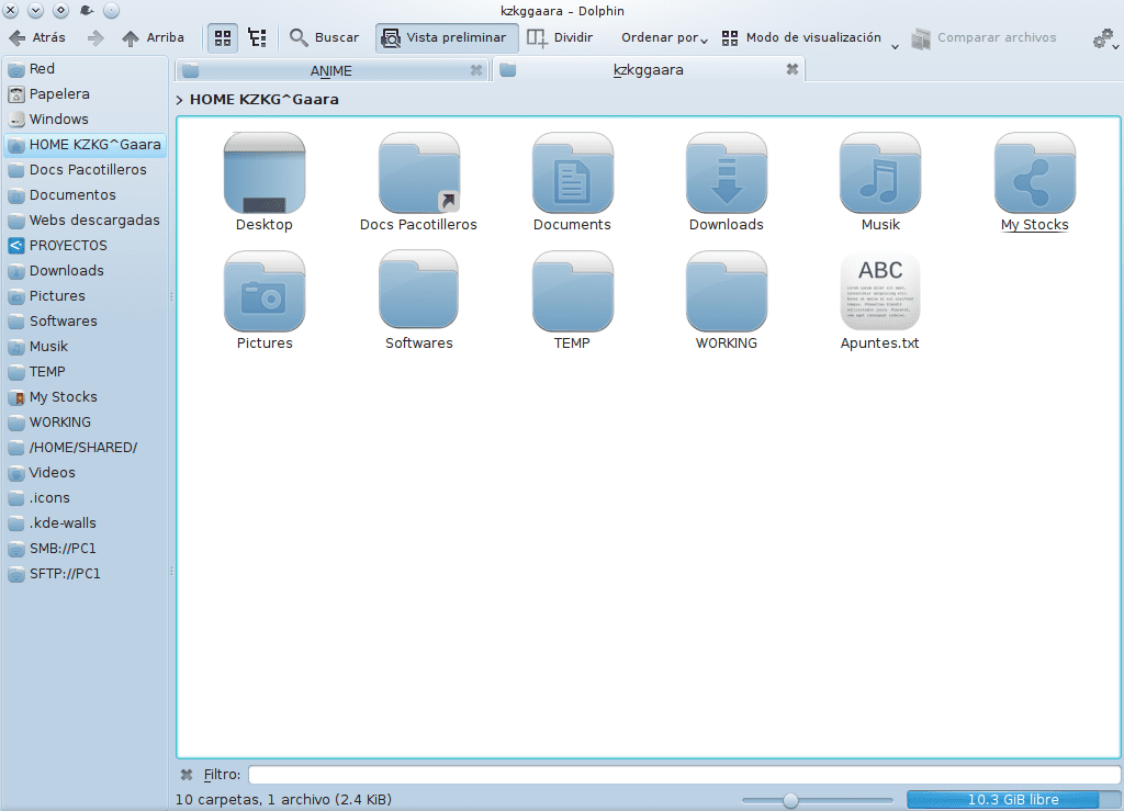
And this is the Mint application menu, or so I think hehe:

The author (Alessandrobo) in your contribution in Kde-Look confesses that the icon pack is inspired by Faenza yes, but the appearance is much simpler and minimalist, here are the download links:
Well there is not much more to add 🙂
This set of icons for some may be very round (as it happens to elav), but for others (like me) they give an air of freshness to the environment
regards
Very round for my taste .. and Faenza, like not anymore ..
You don't like Faenza? What is your favorite set of icons?
Faenza bored me already .. I like squarer icons, I prefer Elementary for example.
And what do you think of Lubuntu Box?
Nitrox
Too much curve, too ... gay? An edge is missing, an angle, something harder.
Ha ha ha ... no comment ... ha ha ha
123MB is heavy. I will test it in Mageia.
It makes me
If it includes the Blender and DraftSight icons I'll take it ... Downloading.
They are not bad but for now I am staying with KFaenza.
I like it. Also with the shortage of complete icon themes that exist in KDE everything is welcome 😀
Now I have a conflict: Kfaenza or Potenza?
They remind me of NitruxOS. And they took away what he hated most: the square, yellowish NitruxOS folders. It's so beatiful.
The nitrux bring a "Buttons" version that makes the folders and icons have rounded tips, which if they follow the yellow folders xD
Heh. True. Although I would also like the Kfaenza with the original XD folder icons.
This weird. I like the latest from Lubuntu better.
Better nitro or h20
I like them at least, for a change a little, and I faenza like they bore
I like it, now I have to decide between the similar MAC icons or these. 🙂
I do not like.
I found these icons a couple of weeks ago, very good although they still call me awoken a lot
Very good, downloading. They will look great on my KDE
They are nice, although personally I like the Nitrux KDE more.
Greetings.
They are nice, although from what I see with the naked eye .. it would be necessary to detail them a little more and not leave the color so soft in all
I like it, I'll see how they go ^ - ^
As faenza there is no equal.
Yes, the Kfaenza hahahahaha trololololol ...
Now I am using K-HI-Lights, but I will try these, the images you placed look very nice.
Try KFaenza for KDE. Very nice and has icons for all applications.
Does anyone know where I can find a theme of pixelated and straight icons like the old versions of Red Hat? What an 8 bit beauty mmm…. precious and without so much shine or tiresome reflection.
thanks!
I really like the kneda and Ronak desktop themes for kde, they are excellent, what desktop will canaima bring 4 kde gnome unity xfce or another? icon theme looks interesting although canaima 3 icon theme is very good even canaima 3 wallpapers are very good