These days I have been working on the new design for the blog, something that already I had commented to them last year and I already have the first mockups ready, which differ a lot from the previous ones that I showed you.
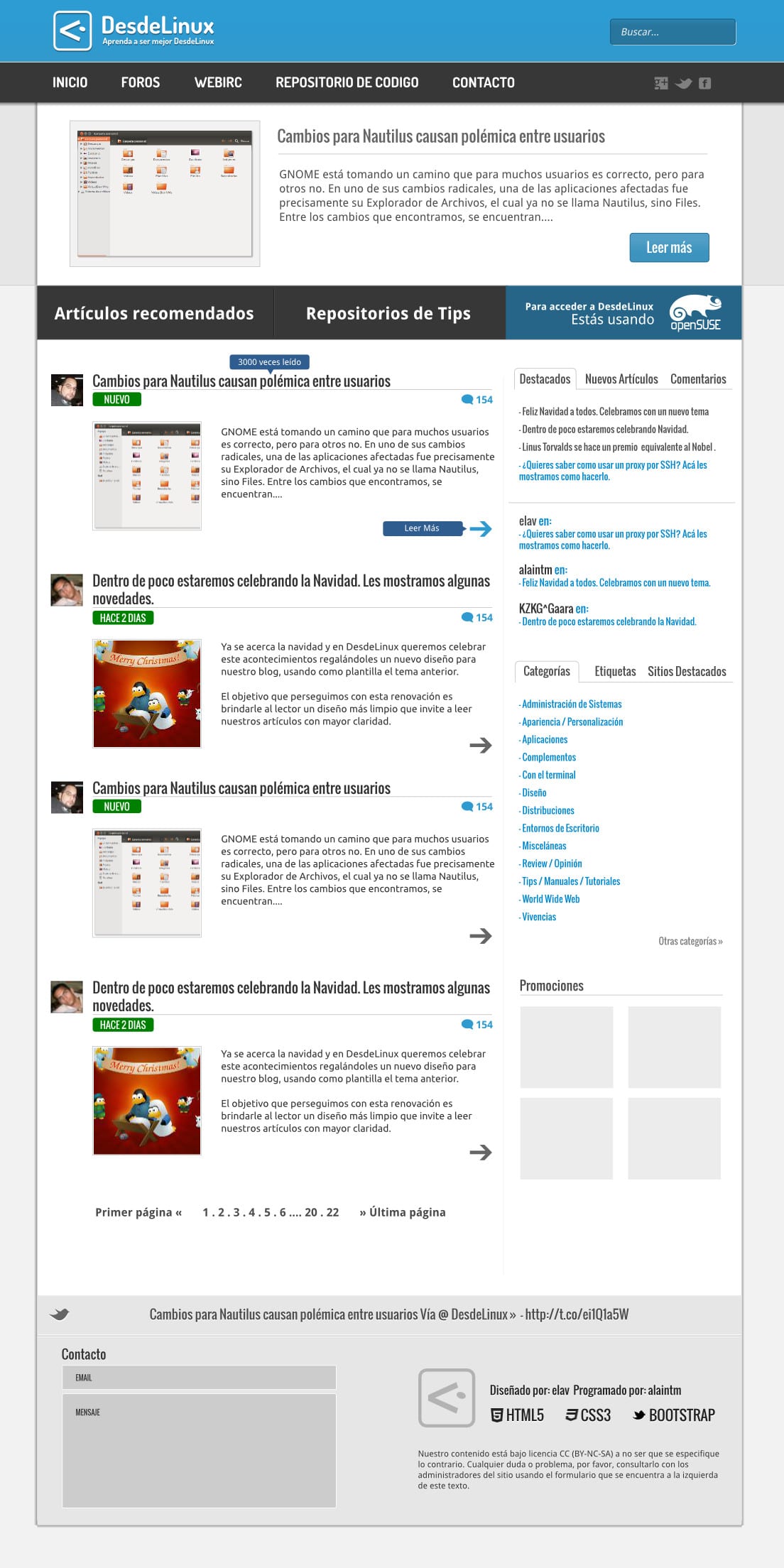
For the main page we will have something similar to this:
And for the articles something similar to this:
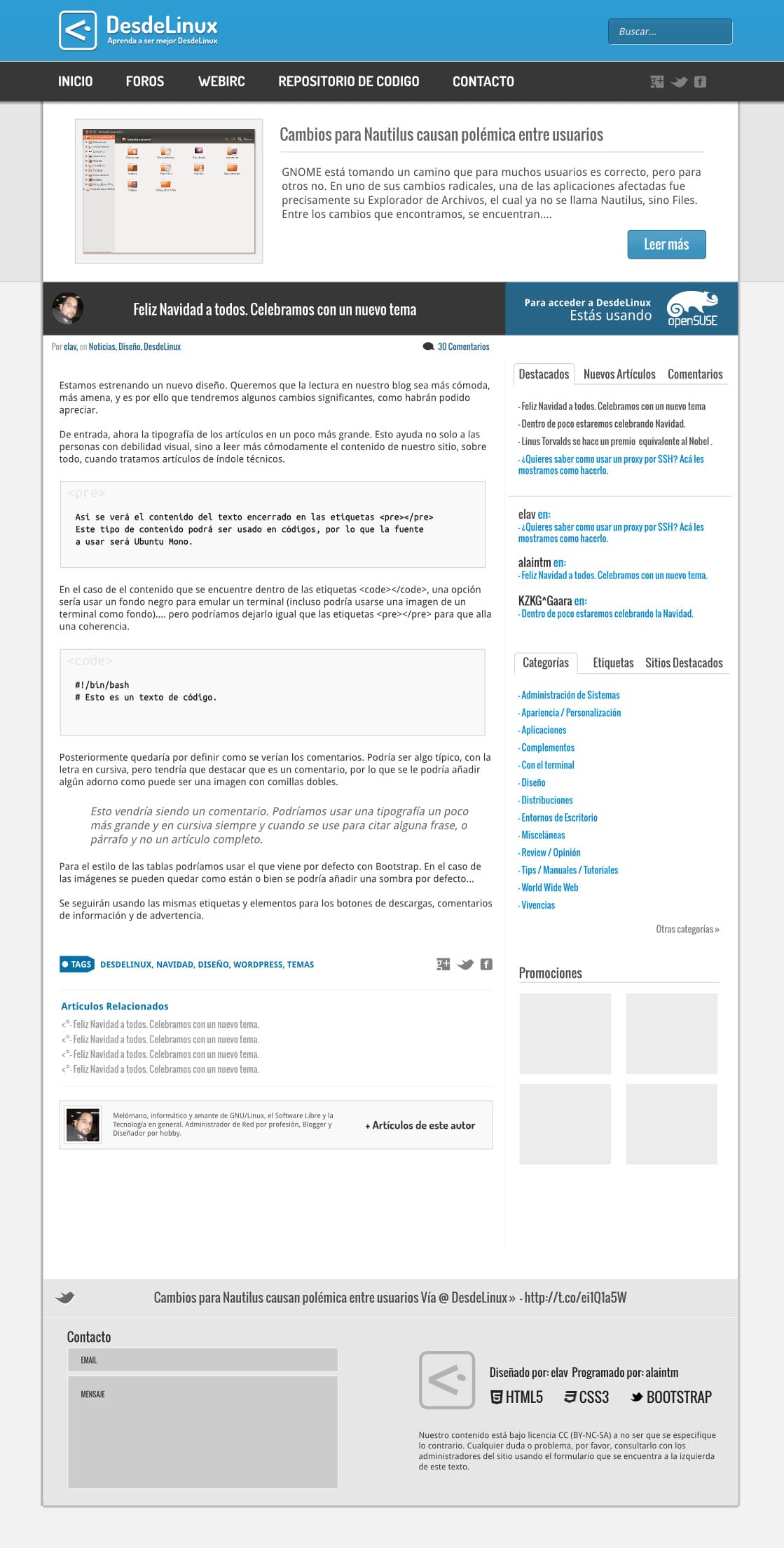
In the latter case, it is still not clear to me if we eliminate the Recommended articles that appear at the top randomly, it is something we have to discuss, especially to maintain uniformity in the design.
Right now, due to time constraints, I can't give you much more details, but any suggestion is welcome.
Looks great
Congratulations this excellent 😀
Thanks ^^
Oops, sorry I was testing links to comment, and it looked ugly in the comment, if it could be removed 😀
"It looked ugly"
I mean the error that came up in the comment, I think that links and gentoo did not match in the preg_math of the comments plugin, but it is weird because it showed the logos ¿?.
"If it could be eliminated"
I meant that in the new version or another we could delete our comments, as in blogger for example, it is an idea.
greetings again 🙂
I don't like anything ……… .. hahaha I'm kidding. The mockups are excellent, I can't wait to see it in reality. And well, I think that the recommended articles take a little space at the top when reading an article, although I know that it is nothing more than scrolling, but it is only a detail.
It is true that they take a bit of space, but sometimes there are very good articles that go into oblivion and this is a way to make them remember them .. Thanks for the comment.
I mean when reading the article, like right now. Sure they should keep it, but in the middle of reading it's a bit distracting. I say nothing else hehe.
Yes, it's true, but if we remove the upper part, the design breaks ... I'll see what I invent 😀
I agree with Blaire Pascal's comment, I think that leaving the recommended articles on the main page is enough, although I understand that that will give them more work. Another thing, I do not see the comments anywhere; Will we have to click on an additional link to access them? For the rest, I think what they have done is very good ...
In fact we are not going to leave it, we will put something else in its place and of course, in a smaller area ..
The theme is nice, it looks cool, congratulations to the web_dev ...
How about Elav.
It seems like a very good design to me. I hope they will have it online soon.
Greetings.
Great!. Now to wait to enjoy it.
Greetings.
I think this design is a great goal !! I don't see the need to change it .. when a formula works, it makes no sense to change it .. there are many Internet sites that have kept the same aesthetic line for me for years and are still current .. ..
DO NOT CHANGE THE DESIGN .. you could try polishing some small details or, without altering the blog, or also play with some new colors, to give it a fresher tone .. but this design is the product of the success of this blog ..
You know I like that that I already put up the converted web to be able to reference it on Twitter ... That and what you told me about static things to save me internet couta lol.
It is spectacular !!!!
Although I continue to insist that it would be great if our comments also reflect the desktop environment we are using. 😀
But the change is very good and it looks nice clean.
I do not think that's possible…
It is the same as another blog that I have come to visit visitar
Nah, lie !!
I love it, let's see when they make it come true 😀
They are both great 🙂
As always good ideas and style in the mockups! Hopefully all that can be converted to code. What I liked the most was the new design to show the logo of the distro and the title area when reading the articles.
Very good design as always, I would request that the "Recommended Articles" be TIPS that have been made.
That. Regards.
They look great!!!!
One thing I don't see is random polls. Are they going to take them out?
And another thing (I'm quite annoyed today) in the mobile version the polls appear randomly 2 times and it would be nice if they only appear once so it loads faster.
Those are all my criticisms, the rest are pure praise and congratulations
Ahhhh, yeah. I also like random polls, I would like the question of the week, like in xataka science, but with a poll about something that happens. For example, "What do you think of the KDE 4.10 output?" or something similar.
It was not annoying, it was angry because I wanted to annoy !! I am designing a website too and I always get fussy. But they are nothing more than subjection.
Don't worry, one or no survey will appear in the mobile version 😉
Cool.
I like the design, although I think that the black bar for Start, Forum, WebIRC, etc. would be quite annoying when reading on a small screen, such as a netbook or a tablet, unless that bar is hidden when scrolling. The rest, very cute and elegant ^^
Yes, the bar is hidden, it will no longer remain fixed as the current one.
Wow, that is great 😀 Are you going to get rid of the f * cking Facebook widget that overshadows the web (Responsive Design) on small screens like mine? (320 × 480, 3.2 inches).
I didn't know that the Widget screwed up the Responsive .. that's easy to solve 😛
Hello to all the readers and staff of the site.
I am new around here and I would like to congratulate you on the magnificent work you are doing with the blog.
I would like to ask a brief question, is the theme you are using available on your website for download?
I imagine that in the case of a website on GNU / Linux and Open Source and since its content is under a CC license (BY-NC-SA) it will be possible to download said theme.
If this is so, could you tell me where it can be downloaded?
Thank you very much in advance.
codelab
Greetings, the theme is currently unavailable, mainly because it still contains bugs that we are fixing. Once we put the new theme, we will finish fixing this one that you see now and it will be available to everyone ..
Very kind for the answer elav.
It is pleasant news since the web design is looking very good, clear and pleasing to the eye.
A greeting and thank you very much.
It's very good. I think the "recommended" could go under "Promotions", so they don't take up so much space.
Mmm good idea .. 🙂
That seems great …
: )
I like the design proposal. Personally, I would not only like the article view to not include the recommended article at the top, but I would like the sidebar to disappear in this view as well. Instead, I'd rather see a breadcrumb at the top of the article, author details and related articles at the bottom, comments below, period.
This way, the space could be better utilized for those of us with 16: 9 screens of 19 inches or more (bootstrap has a fluent template that would be very useful for this), and I think it would also be beneficial for those browsing with mobile devices, as there would be fewer things to carry. Anyway, for me, it doesn't make much sense to replicate the sidebar and the recommended article for both views, having them in the main view is enough.
Anyway, it's just a suggestion based on what I'd like to see. 😉
Thanks for the suggestion Hugo, we will take it into account. In fact, I have always liked blogs that eliminate the sidebar in their articles, but I don't know to what extent this could be good or bad for a user. The Breadcrumb is on the way too 😀
Obviously, removing the sidebar has its downsides, but you could probably move the really essential widgets (like the login one) elsewhere.
I do not know if, in addition to all the above, you will seek an html code that validates. The current one has 45 errors ...
I already know that it is an aspect that the visitor does not value until they find a terrible view of the page, which fortunately is not the case.
Greetings.
I like it!
Congratulations on your hard work, Elav!
I know perfectly well how hard the "silent" job of (re) designing a blog is.
Brotherly hug! Paul.
Thank you very much Pablo. I'm still working on fine-tuning details and accessibility issues with the development team 😀
I congratulate the blog very well, it is minimalist. very good.
Very good article Elav !!!
I've gotten some free mockups at http://myfpschool.com/los-mejores-mockups-para-descargar/
Do you know any place where I can get more? It's for a university job.
Thank you.
What I really do is observe new trends, some designs and get inspired. This in question was never implemented.