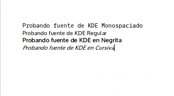
Some time ago I told you that KDE will also have your own font call (like is logic) Oxygen, which we can already test.
A reader through a comment has passed me this link where we can download the typography to test it in different variants. We can download it in several ways through the terminal:
Using Git:
git clone git://anongit.kde.org/oxygen-fonts
Using Git with HTTP:
git clone http://anongit.kde.org/oxygen-fonts
Or Lowering the tarball:
wget -c http://anongit.kde.org/oxygen-fonts/oxygen-fonts-latest.tar.gz
With any of the 3 methods, we will obtain 3 folders which we can put inside / usr / share / fonts o ~ / .fonts. And ready..

At last a native source for KDE, always having to be invented with other sources. By the way, someone has already tried them, do they look good with antialiasing and 96dpi?
I just tried it, it looks blurry like I said before ... I use antialiasing but I don't use forced 96dpi or any other.
Is there something similar in arch to dpkg-reconfigure fontconfig-config? With that in debian it solves the forced to 96dpi.
The truth is that I do not know, as if it did not hit KDE (I can not explain it better)
Testing, it looks great, thanks elav.
Either I have vision problems or I see the regular font blurry ...
Yup, it's opaque ... blurry 🙁
Well, you do have them HAHAHAHA
I don't know, it looks blurry, I don't like it
I don't know if it's my idea, but the kerning -http://es.wikipedia.org/wiki/Interletraje- is very irregular.
Well now I'm testing them in Archlinux and I have to say that I like them and they don't look as blurry as in the image. I'm going to leave them on.
I have already put them and phenomenal neither blurry nor nothing, sharp and they look great. Those who see them blurry should configure anti-aliasing.
Greetings.
You would be so kind to leave us your anti-aliasing settings here 🙂
In order to know what parameters to put.
Greetings and thanks 😀
For document editing it seems perfect. To keep it as the main source of the environment, windows, menus, etc. I am not convinced ... Droid Sans or Open Sans are more comfortable for me.
Is that for the environment I find them a little "squashed" for the width they have ...
This is not the «final» yet ... I think it lacks a lot of development to have 😀
I stay with Droid Sans.