Well by the time you read this it means that we just finished adding the Fix Pack No.1 to the new song that we released a few days ago. And you must ask yourself ... What's new now? To answer this question is that we make this post 😉
Let us begin…
1. Distro detection
Ya we announced it before, but hey this new functionality is part of the package.
Before we also detected the distro that you were using, and we showed you its logo, now we do the same but in a somewhat different way. As well as, if they click on the logo, they will be shown the articles related to your distro:

And we already add Pardus, Lubuntu, SolusOS, Xubuntu, Slitaz, Chakra, and we will keep adding 😉
2. CSS fixes to display the theme on cell phones
We fixed several issues that existed when the site was displayed on devices such as cell phones. For example, in the upper part you could see a white part for no apparent reason, as well as the text under the image of the article, not as before that was shown to the right of it, making everything a little out of place. This along with some other details has already been fixed.
Specifically errors like this blank space seen above the bar:
And several more details that will improve the way the site is displayed on devices such as cell phones.
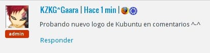
3. New Kubuntu and Xubuntu logo in comments
It is not something new that we also detect the visitor's browser and distro in the comments, but it is new that at the request of pavloco we change the icon of Xubuntu on the comments. When someone who uses Xubuntu commented, the logo of the distro appeared in the comments yes, but the old logo, now the new one appears:
![]()
As well as we changed the logo of Kubuntu in the comments, and we put the new one:
![]()
4. Avatar of the post author
We had conceived it this way, but due to a slight error the avatar of the author of the post did not appear at the end of it, well ... we have solved it:
![]()
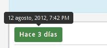
5. Date (complete) and time of each post
One of the suggestions that they made to us from the beginning was precisely this. It happens that on the publication date of each post they see something like "3 days ago" … And you wanted to know what day specifically that post was published (That is, to know for example that it was published on August 7, 2012), now when they put the pointer over the simple date, the complete date appears:
6. Articles NOT so prominent in the "Highlight" area
The theme that we had before had a completely different information structure to this new one, which caused nothing important or prominent articles to appear (such as the output of Firefox 7) in the area of "We highlight «We already solve this by cleaning all articles of this type.
So now the posts that appear in the "We highlight" They are really the best 😉
7. Smaller "Highlight" area
Another thing that they asked us a lot hehe. It happens that the idea of randomly placing an article was really very good, but this area took up too much space on the site, well ... as you have already noticed, we reduced this area a lot and now it is still noticeable, but it takes up much less space than before :

8. We removed the JetPack comment system and put our own
How to Live Aligned with already explained elav In another post, we deactivated the JetPack comment system and put our own, which benefits that now the nested comments do work well, and the email subscription to the comments and their responses works well.
The negative of the change is that we lost integration with the accounts of Twitter y Facebook 🙁

9. Login widget now takes up less space
Now the widget (area) in the sidebar (bar on the right) takes up less space than before:

10. Lowest floating (main) bar:
Another change very requested by you ... because the bar was too high (big) and made reading difficult etc, well ... we made it smaller now 😀

11. Slide effect in search box / box already works in Opera
Precisely as it says ... before the cool scrolling effect that we saw when we clicked on the search box, it did not work in Opera ... well, it already works 😉
12. Changed GitHub logo to OpenSource logo in footer
In the footer or footer, we have the logos of technologies with which we made this topic, before we had the logo of GitHub where it said OpenSource... not now, now we have the logo of OpenSource Hehe
13. Rank of each user in label under each one's comment
This is something that we had in a very archaic way before ... to explain this without much trouble, depending on who you are on the blog will be the text and / or label that appears under your avatar.
- RED: Administrator of the site.
- Verde: Editor/ Contributor to the site.
- Dark Blue: The Author of the article you are reading.
- Light Blue: Editor of the site.
- Orange: User registered on the site.
- Grey: Reader of the site (that is, unregistered user).
Simple to understand right? .. well, I leave a screenshot of how it looks:

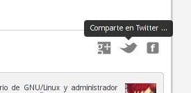
14. Icons to share the post at the end of it
We will remove the share icons that we have now, replacing them with our own ... by the way, they are still in the polishing phase of some other detail lol.
15. Text of the last tweet centered
Nothing ... a simply aesthetic detail 😀

16. We will use a download button
When we want to indicate the download of something, now we will use a pretty cool button:
To use the button I leave the code:
[ download u=http://link.del.archivo ]
17. As you have just seen, we also have a box for notes, important information, etc.
Just as I just said, now we will show the important or interesting information or data in the way you just saw above ... like this with a cool blue background. Ah, an icon will be put on it, this detail we have not done yet.
18. We also already have an alert box.
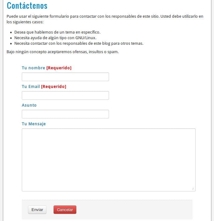
19. Improved "Contact Us" style / appearance
Well this doesn't require much explanation. We simply made the appearance of the contact form page more attractive, more in line with the rest of the site.
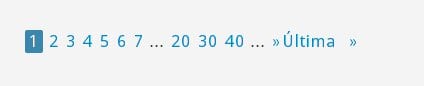
20. Pagination with best completion
Pagination? ... Yup, those numbers that allow you to change pages now look better thanks to that button-like appearance that we put:
21. Increased font size in comments and darker color
We had the comments with a gray color, and the text somewhat small, we simply darkened the text more and increased its size, now everything can be read more comfortably:
22. We put the icon + link to the social networks where we are present in the sidebar, as well as the RSS one.
Through these links you will be able to keep abreast of what is happening in DesdeLinux for your favorite social network.

23. Changes in the style of the H1, H2, H3
Now these HTML elements have a new style, differing from the previous ones in terms of color and typography.
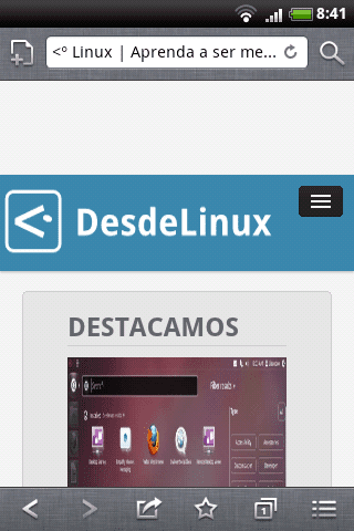
24. On cell phones we optimize the site in terms of elements it loads.
By this I mean that those who open the site from their cell phone will not see the area of the last tweet, nor the area of "Featured", as well as some elements of the sidebar such as the flash promotion, the widget that identifies the distro that you use, and neither does the arrow that helps to go to the beginning of the site. This arrow does not appear because they can go to the Top of the site with just a movement of a finger haha, the arrow took up space that in this type of device is really necessary.
25. Changes in the sidebar.
Well, in addition to the changes that you have read above, also say that we removed the image with the bird and egg that led the user to our account Twitter (we removed it as we put the icons above)We have also added surveys, email subscription, and the odd little thing we can think of 😀
26. EOF…. END!!!.
Nothing more to add 🙂… with this we end this first version 1.0 of the new theme of the blog of DesdeLinux, We hope you enjoy it. Many thanks to all of you who have been there to help, report bugs, give us ideas and suggestions, and of course, support us in this change.
Also congratulate elav for the EXCELLENT design work he did when conceiving this theme, a really great job of him, as well as INFINITELY thanks to alaintm, a friend of ours that we hope will be able to share with us here in a few months, as he has been the one who has programmed 99% of all this topic, without him this design would still only be a .PNG on the netbook of elav.
Cheers guys, girls and nerds 😀
Sincerely…
CONGRATULATIONS FOR THE WORK !!!!
I personally liked the change they have made to the site…. much friendlier and more aesthetically striking than before.
Good job!
Excellent the theme 🙂 looks luxurious .. very professional and everything.
It is seen that they put a lot of time and effort, at good time.
Tremendous work but I am tired and I stopped fighting my dear Iceweasel…. There is no way that he takes the happy UserAgent well, that is, it recognizes the iceweasel but it does not recognize Debian (I don't think anyone uses Iceweasel without using Debian hehe)
By the way, I can't see the range of colors, that is, it tells me "editor" but it doesn't give me the light blue color they say above.
Ok
A suggestion.
Would it be possible to remove the images from the articles in the mobile version?
I am not talking about all the images but the one that appears on the cover next to each article. I say this because (with the phone vertically) they take up a lot of space and also appear above the title of the article (let's see the image first and then the title.
If you don't understand me, I make a screen
Man how are you 😀
Well, yes, of course it is possible ... I don't know if this change will not be liked by some users.
We have to think about this very well hehe.
Excellent modifications; I think that in my opinion you have been round. This is how nice, more and better;). A greeting.
Thank you
Congratulations!!! very nice theme….
Thanks
I think we will have to use Google's philosophy: We are always in Beta 😛
Excellent work I can notice that they use another shade of blue in the top bar of the site.
Yup, we are a bit defining our identity now hahaha.
Looks great. Thank you so much for all the work you have done.
Thanks Tina ^^
I see that between the changes I have been "downgraded" to "Reader"
LOL!
Same as perseus- You must comment with your account for it to recognize your rank.
I'm commenting with my account ... but hey, that's the least of it, what I really want is to cancel this account and I don't see how to do it.
@Tina: Now that's weird, you should at least appear as "editor". To see what they say elav y Gaara.
Thanks a thousand ... although it really doesn't matter much, I just want to cancel the account. 🙂
Hello Tina, one question. With your account you can enter the Administration panel and publish an article? That is, do you notice that you lack any privileges that you had previously?
@elav dixit: Do you notice that you lack any privileges that you previously had?
All.
But nothing happens, really. Don't worry 🙂
Lorem ipsum pain sit amet, consectetur adipisicing elit, sed do eiusmod tempor incididunt ut labore et dolore magna aliqua. Ut enim ad minim veniam, quis nostrud exercitation ullamco laboris nisi ut aliquip ex ea commodo consequat. Duis aute irure dolor in reprehenderit in voluptate velit esse cillum dolore eu fugiat nulla pariatur. Excepteur sint occaecat cupidatat non proident, sunt in fault qui officia deserunt mollit anim id est laborum… testing
Hahaha Has anyone ever seen the translation of this Latin text into Spanish? It is somewhat misplaced hahaha
O_O… what ?!
Tina I guarantee that you are listed as Author (the only person other than admins who has the privilege to post automatically, without waiting for post moderation)
The function of showing the user's rank is relatively new, and since you are the only one with the Author rank there could be some bug not detected so far in it, I will review what happens, I apologize for the error but this is normal when a new product comes out, bug detection and solution.
If after reading this you still want to delete your account, send me an email.
regards
Don't worry KZKG ^ Gaara. Boy, I know all those changes have their drawbacks. In addition, it seems to me that there are other points much more important to correct in all this change.
I'm not going to die if for a while I can't enter to publish. It really isn't that important.
Thank you a thousand for your kindness 🙂
Tina, I just checked your permissions and they are fine, as always, actually in your profile or in the category to which you belong (Author) no changes have been made, everything was in a new category that we created, with the same privileges than Author except for automatically posting.
Not only that, I have a backup of the blog (DB + files) from yesterday and I have it installed on my laptop, I have logged in with your username to verify that you have the correct privileges, and in fact I see that you can publish without problems, so that now I am wondering where the error could be.
It really isn't that important.
Well, for us it is not. Our users and editors are the most important thing to us, so this has priority 1.
Please, write me to my email with a screenshot of the WP-Admin that is shown to you, to see if we can solve the issue of the privileges to publish first, and then once we have solved that we move on to the "author" or "reader" issue.
Greetings.
I already know where the problem is, only that it is too much PHP code to understand by myself, I will call the friend who programmed the theme so that he does the debug as it should be.
Tina solved the Author and Editor.
Still waiting for the screenshot of your WP-Admin.
regards
Perfect ... Thanks a thousand
No, I don't want to delete the account, what I wanted was to cancel the account because I thought that was the problem, but I already saw that it is not.
Nothing, a pleasure.
You haven't told me hehe, do you have the problem that you can't post?
great job
Arigatoo !!!
JAMIN xD
the theme is very cool 🙂
What a beautiful portal they have achieved. My sincerest congratulations. I have recently discovered them. Very good quality of articles, well legible, and above all, it is updated with new notes every few hours. This good site is already on the Opera speed dial.
I applaud you all.
Thank you for your words.
Although the level of publications is not what we really want, it is not bad either, this is an aspect that we have to improve.
Thank you very much for your comment, and welcome to the blog.
regards
Great ! It is fitting very well. Thanks for your job.
Thank you friend.
It looks excellent, one of the best that can be seen on the network of networks 😉
But I keep saying that the floating top bar (blue bar) is too thick (fat)
I do not know if you can change to thinner but to protest that it is not 😛
LOL has not published my previous comment, I gave him to publish he hit a jump and my comment has not come out 🙁
By the way, I am logged into WordPress but it does not recognize me, I have to enter my data by hand.
Yep, we don't have a link to WP.com.
And weird what you said at the beginning ... had the site loaded you completely?
Bros, I had passed the comment that the wide images look disproportionate in the mobile version of the site;).
Congratulations on the great job done 🙂
regards
TT I'm no longer admin TT
You must log in before commenting.
Thanks bro, I am away from the blog for 4 months and my bros turn to <° head XD, what would happen if I was absent for 2 years, would they be Alexa rank No. 1? XDDD
regards
In 2 years Linus Torvalds will write here, and Richard Stallman will demand that they give him the source code of the theme.
It's been 4 long months friend 🙁
Yes you are compa, of course you are. You must log in, since it is your user who is admin. Enter with your user + password and voila, you will see the text of admin, your avatar, etc. hehe.
Ufff, congratulations on the job, I did not imagine that there would be so many improvements. o_O It's a really cool song. 😀
A review of some points:
1. I would like you to add the Funtoo detection in the sidebar and comments.
4. Even if it is repeated, it would not be bad if at least the author's name appeared just below the title. Sometimes it gives me immense laziness to go down to the end of the article to see who wrote it (I usually look at the author first and then read the article).
5. I think that with the date and time it was more than enough, I don't see any use in putting how much time has passed since then. But hey, if you like it like that, it wouldn't be bad to add that effect too hover to the comments.
8. Goodbye, JetPack, we won't miss you. 😀
13. Same thing I said here, here y here.
22. I have also reported it several times: the link to Twitter has a few extra characters. The same works but first it takes you to the main Twitter page and then it redirects to the blog account.
Everything else is excellent, although you already know that every time something occurs to me or detects, I will be bothering here, hahahaha.
Thank you
1. Send me the logo of that distro to my email.
4. The author of the post can be seen before entering a post in the site's index, right?
5. The time that has passed helps to know how old a post is, I also think that it gives a touch of originality.
8. HAHA.
13. What about the colors? I answered you in another comment hehe, but basically pink is not that I like it very much.
22. Done, corrected.
1. Let me find a good one and send it to you. Do you want it in SVG?
4. Yes, but I don't just read the articles index, I also follow the highlights, related articles, links in the article I'm reading, new comments left on old articles, etc. The same is not so important but it would be nice.
Hello,
The first, Congratulations for the new topic. I think it is very cool, and it is nice to see the page as it has been.
Regarding what Manuel comments, I agree with regard to point 4. I think that under the title it would be good to put the name of the author, so that it is visible at first if it is entered from any link other than the main page . It is not something essential, and the author is already on another site, but it would be nice to have it there too.
On point 5, the same could be done for the comments. Many times it is useful to know which ones you have already read and which ones you have not.
And another thing, which can also be seen on another site, would be to put the number of comments just above the comments (below the author's info). So as not to have to go up to the top to see if the number of comments has changed, and thus see if there are new ones or not. It's more for convenience than extra functionality.
I hope you can continue to improve continuously as before. The information you put on the web is nice.
Anonymous greetings and thanks for the comment. About the numbers in the comments, it is something we wanted to do, but apparently things are not easy. Please, if you have seen this functionality implemented in a WordPress-based site, tell us what it is, to see if we can get in touch with its administrators.
ahahahahaha…. The funniest thing is that they put me as the model to show the example xD
HAHAHAHAHA
Excellent, the truth is that the blog grows enormously, it is a must-read for Spanish-speaking Linuxeros. Thank you very much 🙂
Thanks to you for commenting here, it is a pleasure to have managed to gather so many good readers 🙂
Good evening, hard work without a doubt. Congratulations, this has been an example of the few websites that achieve rapid user acceptance and that grows as time passes.
Regarding the useragent to recognize the distros, I'm currently on Solusos 1.2 Eveline (Latest Release) and I only see the Tux image indicating that I use Linux but it does not recognize the distro yet 🙁.
I hope it detects it soon, I use firefox to navigate 😉
Regards!
Hello there,
About the distro, you have to define the Firefox UserAgent to recognize the distro, here I leave you a tutorial that can help you.
About the first thing you comment, really thank you very much for that. It has always been our goal to achieve a good atmosphere, to make the few users who visit us feel comfortable, we hope we have pleased some at least.
regards
Excellent changes! I really didn't expect there to be so many. Congratulations, every day <· Linux takes more shape.
=)
Ai .. I don't know why my firefox UA by default marked Ubuntu instead of Xubuntu ..
It really doesn't have much to go into DesdeLinux, but I'm here to stay and as Pavloco says, it is recommended reading for any Hispanic person who wanted to advance in the world of GNU/Linux, and well, the truth is this topic is very good (elegant, pleasant colors, and pleasant subtle details) Well, they look cool, as we say here in Mexico. CONGRATULATIONS to all the people who make it possible DESDE LINUX!!!
Thanks for the comment (I.e.
Congratulations also to you, who are already the main reason why DesdeLinux keep going… improving, trying to please everyone 🙂
regards
Excellent change, pa 'lante.
Very good work. Although ... are they my ideas, or in the process of change elav degraded to sandy? hehehehe.
Don't listen to me, it's that although KZKG ^ Gaara is really the author of the post, as visually one was used to seeing his icon with the admin role in red, I couldn't resist ... 😉
I think admins should always have their color red, even in the articles they write.
Also the editors (its green color in this case).
HAHAHAHAHA no joke hahahahaHAHAHA
Excellent, the changes have greatly improved the loading of the site and now it is more attractive xD
regards
Numbering the comments would also help your reading especially in the posts that end with many.
Good idea 🙂
We had thought of something like this, which I don't remember why in the end it didn't get hehe.
Great. I would recommend that the site also detect ZorinOS and Deepin as they are excellent Linux distros
Send me the logos to my email 😀 -» kzkggaara{@}desdelinux{.}net
Wow, how quickly so many things have been corrected 🙂 I have to continue testing the mobile web a bit more in search of problems, but excellent work with the theme guys 😛
Esteee, I'm a copywriter but it comes out gray instead of purple ee
I was trying to fix a bug, but at the moment no way 🙁 ...
Everything is looking great ..
I can't get the banner to show me that I use Arch. What's more, reading a fairly previous post, and doing a copy + paste, says that I use Debian. Error, I use Arch .. 🙁
That happens to you to do copy / paste not paying attention to what you copy, hahaha. Somewhere in the user agent that you copied says Debian. Delete that, look for this part:
Linux i686;
And go ahead and write Arch:
ArchLinux i686;
Looking at your first comment it says you use 64 bits. So instead of i686 put x86_64, So:
ArchLinux x86_64;
Yes, colleague, I had made a copy + paste without looking .. I have already left the line as it should be = D
@Leper_Ivan: In fact it was not like that. Here I answered you.
How good..
you are alone ..
but now I can't test it because I access it from the mobile ..
and I still couldn't test 1.2 🙁
but the subject is very good ..
you have to battle with Opera Mini to get it ready, but it is not a problem, since the intention to read them is stronger ..
Good taste in design, it is very seller. great. congratulations. You can tell they are just achieving great things.
Thank you very much for your comment 😀
One moment I do a test
Nope, it doesn't work on Chrome and Fedora 🙁
Congratulations, the blog looks great, I just can't configure it to show Fedora and Chrome yet
Congratulations on the design, I really like it 🙂