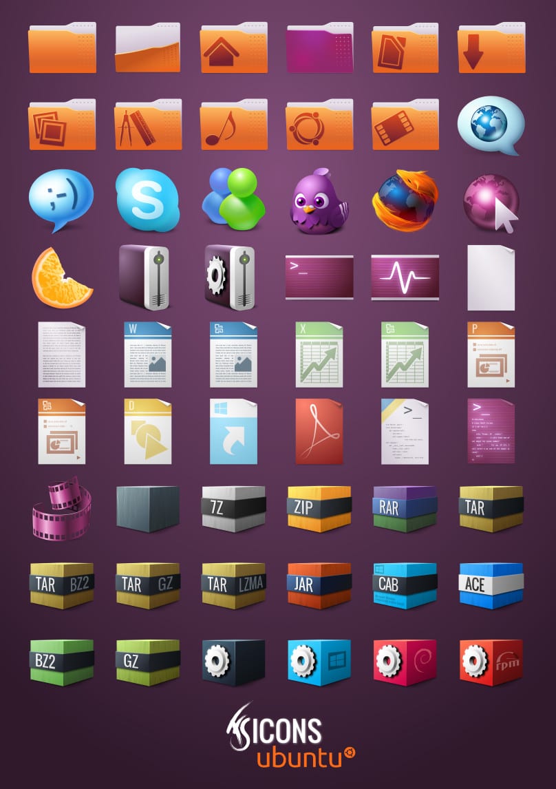
Now available for download FS Icons Ubuntu (20.1 Mb) a lovely icon theme inspired by Ubuntu, designed by franksouza183 who has been doing an excellent job that we can all enjoy.
![]()
The project is still in full development therefore it is not completely complete. We can use them both in Gnome/Xfce as in KDE. I personally love them, so I'm going to download them to try them and see how they look with my desk. 😀
Download Icons
They are great
Cheers(:
I just tried them out and they look great. Although icons are still missing for most of the applications, so I continue with my Elementary 😀
seriously? hehehe I will wait a while to try them, meanwhile I will continue with the faenza
Cheers(:
The pidgin icon is super-cool! 😀
He's very cute = ^ # ^ =
The color of the folders is not one of my favorites, but they paint very well. I'm going to try them right now, hehe.
Ubuntu should change their icon theme to one similar to this one, I think they had tried but dropped the idea. They would also have to change the gtk theme, the
current look dated and rough. The presentation of a product is very important, I am sure that many people tried Linux for the effects of compiz, for example.
I consider that Ambiance / Radiance is one of the best Gtk themes that exist for GNU / Linux, but hey, for the likes ...
so very pretty.
GREAT !!!!
Pidgin's is SUPER-HYPER-EXTRA-COOL !!!! 😀 😀
hahaha, something like that comment xD really that if it looks "deluxe"
The folders are very cool and the cubes of the packages are very solitary.
For those who want something more neutral there is also an icon pack called FS Icons. It is exactly the same but without the colors of Ubuntu
http://franksouza183.deviantart.com/#/d4rrbmu
The truth is that they are quite good visually, but since I sometimes like black in rice, I only see a problem in two matters. Unless he is an employee of Canonical, he should not (and I do not see the desire) to be calling Ubuntu things, it is worth that he falls in love or whatever, but on the one hand that rather threatens his work because it makes him once exclusive and tribalist from the same name and that on the other hand Ubuntu went from being a South African word to being a trademark patented by Canonical and perhaps it cannot be using a brand of another. It is true that they are unlikely to tell you anything, but in the best of cases at least you would be promoting someone else's brand.
Another good news is that they are GPL: D.
Thanks for the comment, the answer to your question is simple: I am passionate about Linux, I am not making these icons without ulterior motives that give an innovative visual environment of penguins. The name "Ubuntu" in the theme name is simply, as the other said, because it targets this distro, nothing more. I just hope you enjoy the topic because I do it in my spare time, with great good will, with the intention of gaining more users. Google translate (hopefully you've done your job correctly): D. yours
Yes, don't worry, I understood your intentions but unfortunately it was after I sent the message.
Part of my criticism is based on the many contributions that are usually seen but always focused on a distro (almost always Ubuntu) and I don't know if the artists are aware of the "pain in the ass" that seeing that causes for those of us who are not from that distro because it is somewhat exclusive.
And in this case, while I thought that was the case, I couldn't stand it for a second and I immediately regretted it because the contribution was really good, at a level not usually seen.
But I repeat, fortunately that was not your case. In fact, if I were an artist I would also make a RAW version (or neutral) and optionally a version dedicated to whatever I wanted.
The other part of my review is something that does not change much. I am somewhat reactionary with companies that are . suspicious of
brandswords that they patent and my treatment tends to be based on what they make (and what they demand). Although you can be calm because I am (almost) sure that they will not claim anything from you, if rather they should be grateful.PD1: In my first comment I made several typos, extra words, changed letters, and missing words. In itself I prayed that native speakers knew how to understand it, now I pray more that Google Translate does a miraculous job of translating and correcting.
PD2: Google Translate did a good job with you, you almost pass for a native speaker. I hope it also does my writing. 😛
Thanks for the answer, as the subject of patents, if any problem by using Ubuntu name in the name of the subject, I can change, no problem, I really do not cause problems, much less want to have them: D
As much as problems I don't think you have (I don't think they have the clumsiness to do it) but if you want to put things more on track, as far as I know one cannot call things «something something Ubuntu something something«, What yes I that could be done is «something something»(See Ubuntu) or (for Ubuntu) or (Ubuntu style). And the other thing is that it must be made clear that there is no relationship whatsoever with Canonical and that they have not been involved.
And well, it only remains to congratulate you on that great job. I insist, it has a huge quality.
@Ares, you are right! You opened my eyes, my strength is not obvious. Thanks for the tip!
PS: I came to see him late, after sending the message. I deduce that the fact that they are "ubuntu" is because they have given it a special coloring, for? that distro.
Well, although some of what I said still makes sense, at least it is better understood why it is the way it is.
I installed another pack and they look very cool: http://i232.photobucket.com/albums/ee1/daytrippergirl/Pantallazodel2012-03-17203451.png
And yes, they look great.
Are these complete? Or is it missing applications like the others?
Incomplete for now….
That pack looks better.
ahhh I can't install them in Kde
some help would not hurt 😉
😀
In the folder you extracted the zip files? Try to draw (as an administrator) in / usr / share / icons, this tutorial should help >> http://www.youtube.com/watch?v=m5fRRcMS23E&feature=youtu.be
Unzipping in the ~ / .icons folder should suffice.
😀
thank you!
😉
they look a lot like the yellowicon icons that said they were going to be put on lucid
They look good I would like one of blue tone haha 😀
They are already installed and with the theme I have and the Ubuntu colors are 10 😉