I was at the Barber a few days ago and while I was waiting for my turn I started to read some Magazines that were there.
Then I found an ad that caught my attention, not because of the information itself, but because of what you can see in the images that I put below.
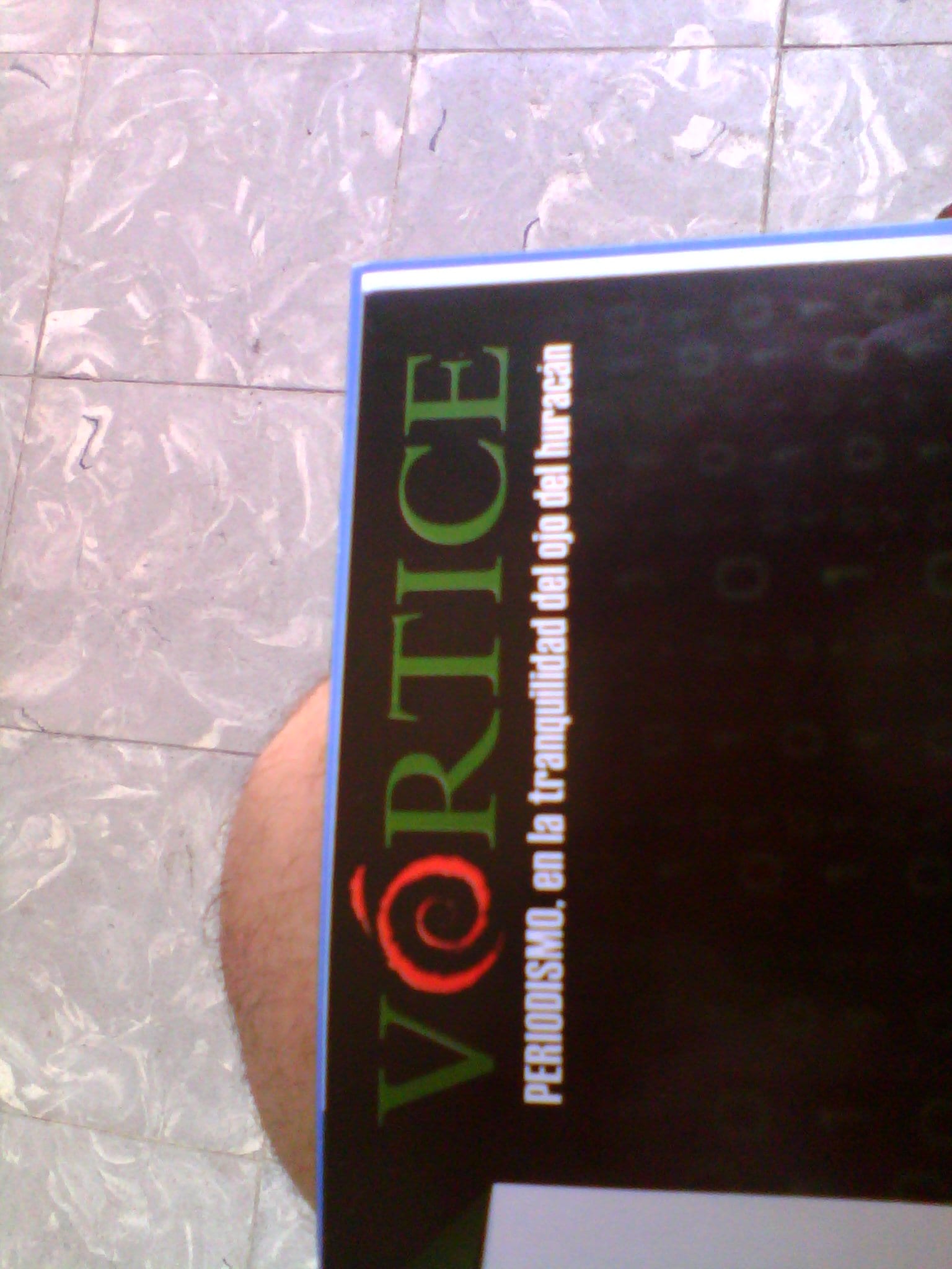
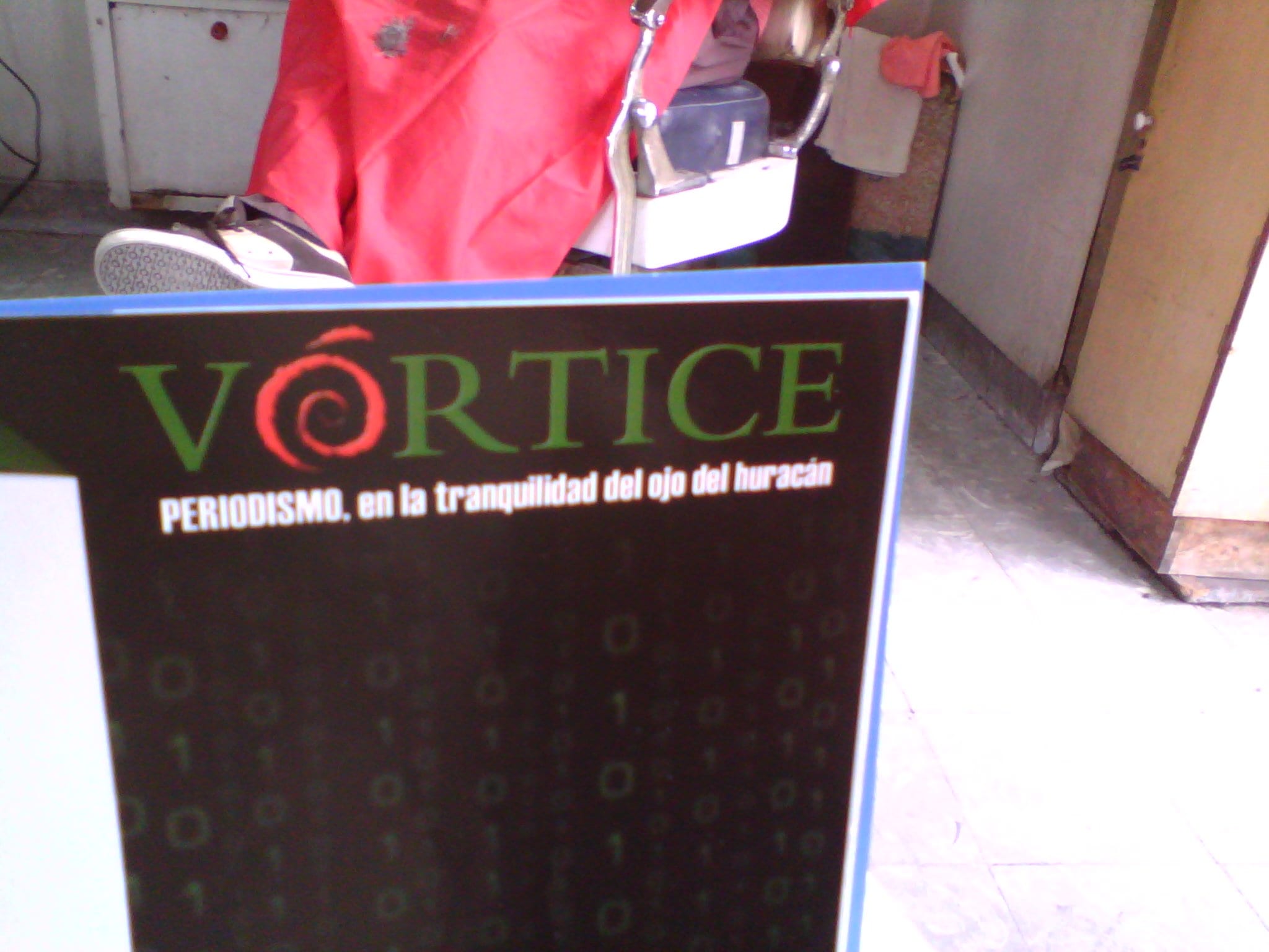
Do you see any similarity with the logo of a certain distribution that we know? No? Well, what about this image?

Indeed, the Vortice Magazine use a spiral in your logo. And I wonder, Chance or Copy?
Shameless copy I would say XD ..
According to Debian logos, the spiral logo is free to use
https://www.debian.org/logos/
The fact that the Debian logo is free does not mean that they could be a little more creative. Also, according to the same site that you link:
In other words, from what I understand it can be used to refer to the Debian project, not to another project. Or if?
It is what it has, that tomorrow someone will come out spreading a distribution with the Debian brand and logos without being it, s Debian cannot defend itself from this alleged attack on its product. I agree with the use and distribution of free software, not the brand or logo, although the vast majority of us respect it, there may be people who do not do it, or if they do it, it could be for bad purposes.
Tell the tanglu people, they wanted to use the Debian logo replicated twice and the two copies chained. The debian ones gave them trouble. So if you look at the arm they have like two teeth.
Neither chance nor copy. This is called PLAGIARISM, a vile plagiarism!
Clearly it is a copy !!!
This is called having a Debian server and not having a sense of humor.
Here you have another similar case but with the Arch Linux logo
I forgot the link uu
https://bbs.archlinux.org/viewtopic.php?id=159730
That is much more obvious. That is indeed plagiarism.
One more example, but this time of ...
http://i.imgur.com/q4rVeq1.jpg
He has balls calling themselves "Inventive" Arts xD
LOL
Being strict, the copy comes from Buzz Lightyear's chin.
Well, let's see if Disney realizes that.
It's a vile robbery; @
Your site is made in Joomla.
Nor will they know what is called Linux.
What bullshit is this? .. 1 both logos are of different colors, have different brands and end differently, that only starts in the same place makes it a coincidence, 2. It is not plagiarism and it is not a small idea, it is called Vortex and takes into account that the picture is. something simple did not seek to do something abundant because it is not the sense. they certainly look alike, they are not the same and they are not for the same thing.
so this note seems to me simply as a yellowish note. to get people to talk to the park.
Steal something for real, ask the Chinese they steal everything, exactly the same as the original.
You have 41 approved comments in DesdeLinux And in none of them do I remember having disrespected you. What for you is a "bullshit", for me is "my opinion" and of course this article aims to create a debate on the subject being addressed.
The fact that the color palette changes, the fact that the position where the drawing ends or begins is different, does not mean that they have copied the Debian logo.
"[…] Does not mean that they have copied the Debian logo."
This doesn't sound like opinion at all.
Strongly agree with your comment regarding Beny's tone, but strongly agree with your comment It is a spiral, a symbol that is millions of years old. Not only do they end and start in different places, but the shape is different, while the Debian logo is oval, the magazine logo is circular, and the twist is different.
The only thing that the two logos have in common, the only thing, is the effect of the irregular edges. And while the Debian logo clearly represents a brush stroke, in the magazine they used the cheapest texture they found in Photoshop.
Get out your Occam razor, gentlemen.
Ambiguities, ambiguities eveeywhere. And it is thanks to these kinds of details that patent and trademark trolls take advantage of it.
In fact, they would have put one more twist on it so as not to have problems with the Debian "spiral".
"In fact, they would have put one more spin on it so they wouldn't have a problem with the Debian" spiral "."
Well, they are not the same turns. Debian's is a full loop and is a bit short of the second. The magazine logo is two complete, exact turns. That they are two exact turns denotes a poor design (as I implicitly mentioned in my original comment) and precisely because of this I would be very surprised if it was a copy. But giving it more turns would be an even poorer design, you can give the spirals the turns you want, but in this case the spiral not only makes it a logo, but also a letter in the middle of the text. One more turn would take away the strength of the logo and it would look too 'loaded'. If in itself, the logo of the magazine already looks much more loaded than that of Debian for that last round that is closed.
Don't take my comment out of context Robert. And yes, the spiral is millions of years old, but tell me, could you show me one that is similar to Debian in any other product or service?
The detail in the spiral is not only in how round it can be, or in the colors, but in the shape. They could have used a spiral of even strokes or something. That's what I think.
"The fact that the color palette changes, the fact that the position where the drawing ends or begins is different, does not mean that they have copied the Debian logo."
No, well, if we go to those then no spiral logo will come in handy, because you will say the same, elav.
And I repeat, the logo IS NOT DEBIAN, it is Buzz Lightyear. 😛
I mean what I mentioned to Robert above, in the details of the spirals, their line and shape.
Elav, certainly if you consider what beny_hm has said, you can take into account that to be plagiarism it should coincide in many more aspects. If you look at the debian logo it gets bigger while in the vortex it pulls a homogeneous circle, in addition to the color and the finishes that in debian are, I don't know how to define it, "peeled" while the other only has it one like this at the top left. I think it is not plagiarism and we just talked about something similar two weeks ago. We talked about that if I set up a greengrocer called apple with the apple logo with some fix, there would be no plagiarism since they are not in the same market, now if it were a computer store yes. That conversation stemmed from the fact that some smart ones put a company called twitter.com or something like that on the stock market when it was rumored that Twitter was going to come out naked and a lot of cousins fell into the trap.
In short, it could become plagiarism if for example vortex were a fork or any different operating system since it would conflict because it is in the same field (computer science), like what happened with windows and lindows (or lindowsOS) I do not remember well of the name.
I agree with you in some parts but not in the tone you use to say it
It might be fanaticism. Perhaps the magazine's graphic designer uses Debian and wanted to put that touch to the title just for fun (I might have done something similar, not out of malice, but out of personal taste). I think if they really wanted to copy it at least they would have changed the color a little or mirrored it (It's my humble opinion)
The only thing missing now is that everything ends in a copyright lawsuit, and that DEBIAN loses the ruling of justice and has to change its LOGO.
There if the DEBIANITAS race is going to go crazy.
after the firefox thing .. I vote homage!
I choose by chance, if you look at the name it is vortex and the O that looks like debian is the image of a climatic vortex. Debian looks more like a wave to me than a vortex, but they look alike.
The same coincidence as with the Manjaro logo:
http://forum.manjaro.org/index.php?topic=21.0
Plagiarism to leagues.
Sorry ... but I do see a difference ... they put the accent, right? LOL!
This is plagiarism from all sides.
Hug! Paul.
I for my part would have taken the magazine, and in some talk with someone who does not "want to listen" I would say ... look even those of vortex know what is good, they use it on their page but some do not know ... well now you know it so realize how far free software has come …… ..
Maybe that person would say…. oh, seriously you already convinced me, I joined the force of freedom…. !!!!
LONG LIVE THE SOFTWARELIBRE…. !!!!
It is not plagiarism, it is the following.
Another case of this laboratory http://www.bioclon.com.mx/bioclon/html/ventas.html that without further ado, I take the Debian logo and use it on their medications. Although it is a vile copy, it cannot be considered plagiarism because they used the free-to-use logo. Although this could show the lack of creativity to create an original logo, maybe someone in the company is a user and promoter of Debian, in any case, the logo is released. Either way, the idea is to share, but I think that if someone decides to use a free image at least they should have a note about the origin of the logo.
regards
Then they complain that the firefox logo is a trademark…: /
Copy, of course. They didn't even bother with details like color.
Let me speak from the academy. A text does not have to be identical word for word to be considered intellectual plagiarism, it is enough that the source of the original text is not identified. From my point of view, it is the same in a product, the intention is to deceive the consumer in two ways: the first is by imitating a product instead of the original, and the second is to develop a product based on the design of another. In my opinion, Debían plagiarism in that it can confuse a user regarding the product, let's assume that a person who cannot read but recognizes the logo, can become confused ... Diney's buzz is not in as far as they should recognize from where he took it….
An apology to the purists… I'm writing from a borrowed iPad….
Another very similar http://victorhckinthefreeworld.wordpress.com/2014/03/01/debian-kebab/#comments
Bah pure chance
As a curious fact, the Debian logo appears in some programs that I have used for logo design (AAA Logo for example), it is perfectly feasible that it can be used for the creation of other logos.
HOWEVER. The magazine logo IS NOT the debian logo ... If you notice the Debian logo follows a golden spiral (or golden spiral), the proportions of the magazine spiral is more circular ... In other words, it is a more circular spiral. simple.
Well, I like the logo of the magazine, it reminds me of Debian, which I also like.