|
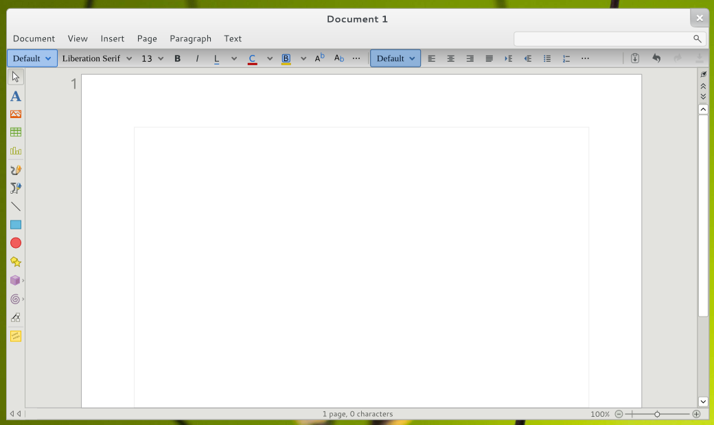
Everyone knows that LibreOffice needs a facelift, to adapt it to the new times and remove the dust from that worn interface that reminds us of the old Win 3.1.
Luckily, the LibreOffice developers are working On it. One of the alternatives that was being discussed in his mailing list was Citrus. |
For now it is only a sketch, but you never know ...

The interface for ipad
In a PC I do not see sense this interface
that good! I love it! how many mockups I have seen from libreoffice and in the end everything is smoke ... what a shame!
Hello I have created a mockup using the Gtk 3.6 libraries. http://www.youtube.com/watch?v=9ckRn_sx8CE ........... http://marianogaudix.deviantart.com/art/LibreOffice-small-program-written-in-Gtk-3-0-309444247
Any change is important, especially in more pleasant colors, but those of us who use libre office every day want to find that menu on your site, we have already machined. I know a lot of people who switched to office 2007 and it became a problem for them, that's why the 2003 menu options appeared in 2007. And the most important thing is that it be more innovative in the functions, go ahead to msoffice, because microsoft wants to show as innovative the change of face leaving functionality aside.
Oh my ... If they can actually implement this it will be a giant leap for the aesthetics and appearance of free software, which always seems to have to be ugly! 🙂
I am looking forward to seeing it!
This barbarian!
They should also work hard on the boards as it is very difficult
Admittedly, the M $ Office suite is more elegant and a little more usable, I say this from my own experience and from those around me, many when they edit in my Writer they get lost among so many menus and do not know exactly which one is in option ... For users it is easier to learn a button with an icon than a menu with words.
It is good that they change the visual. It's been a long time since it has been out of tune with stationery.
What they should really work on is headers and footers, which is a fucking world! If you want to put different headings you have to get into the mess of page styles ... Puff
The truth is that it is cool for that! You already need a change!
Regards,
Jesus.