Hello to those who take the time to read us, yesterday we talked about monitor bandwidth and we create (as always) a featured image with content created by us. Due to the image someone approached us via email and asked us to show him how to create what could be a pulse meter, it seemed like a great idea so today we will be showing how to create it using free software and more specifically: GIMP.
The idea of creating a pulse meter rather came to us to try to reflect that we were going to measure something digitally, so we basically chose a shape and “created” the supposed meter from it. The steps for you to achieve something like this are left below
Creating the basic shape with GIMP
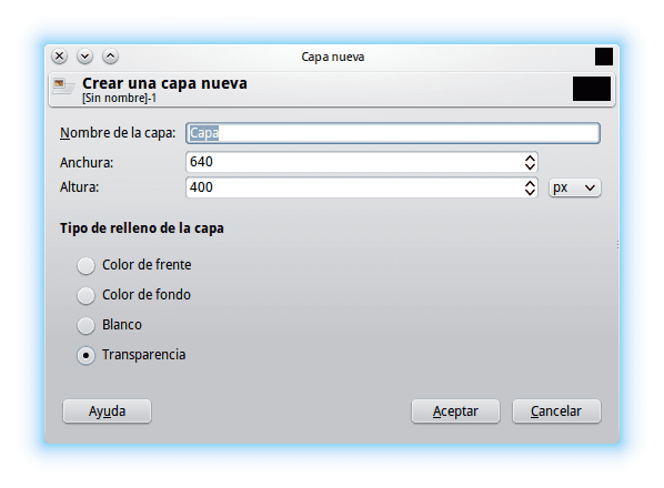
The first step after opening the GNU Image Manipulator Program (GIMP for its acronym in English) is to create a new image.
So let's go to the menu Archive » New or if like we like key combinations, just use CTRL + N. We choose the size they want but to show them we will use 640 × 400 pixels that is neither big nor small.
We choose a color that we want by clicking on the color box and selecting the one of our preference and then dragging the color from the box to the image window. Once this is done, we create a new layer with transparency (working with layers is recommended to speed up the possible correction process without losing all the work). To create a new layer we click on the embedded layer in which it has an addition sign or press SHIFT + CTRL + N so that we get something like this:
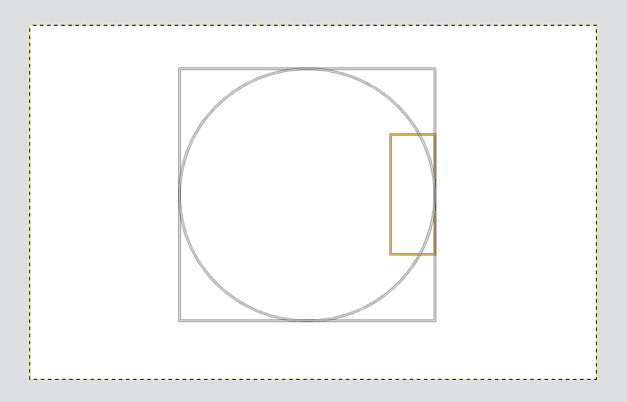
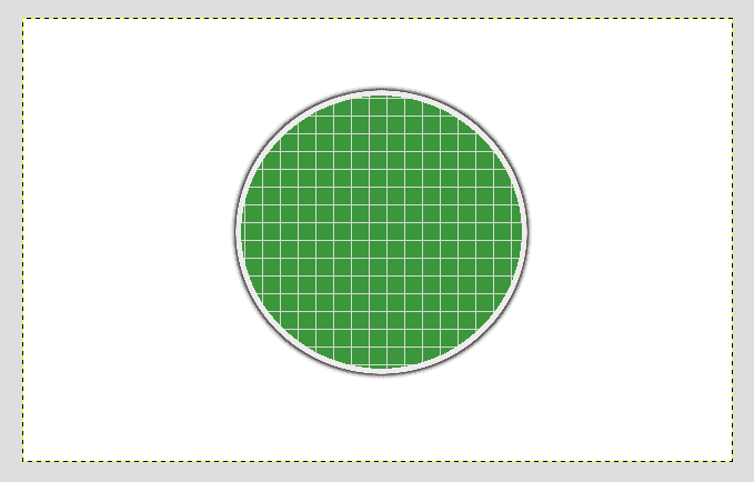
We already have the new transparent layer and working on it we create the basic shape that will help us to assemble the meter. The closest thing to that equipment that we know is the electronic equipment that its screen is circular in shape so we take the elliptical selection tool (E) and we create a circle in the transparent layer which we fill with any color to have a basic shape to work with.

Creating the team body
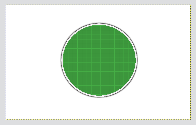
We create a new layer again but this time we do not have to create a circumference but we will use the basic shape and from this we will create what would be the body or edge of the equipment. To do this, we right-click on the layer with the basic shape and look in the pop-up menu for the option “Alpha to Selection”.
Having selected the basic shape we go back to the new layer that we had created but before filling it with color we go to the menu Select and we use the option of Shrink o Shrink with a value of 1 pixel. We choose the color we want for the new layer and fill.
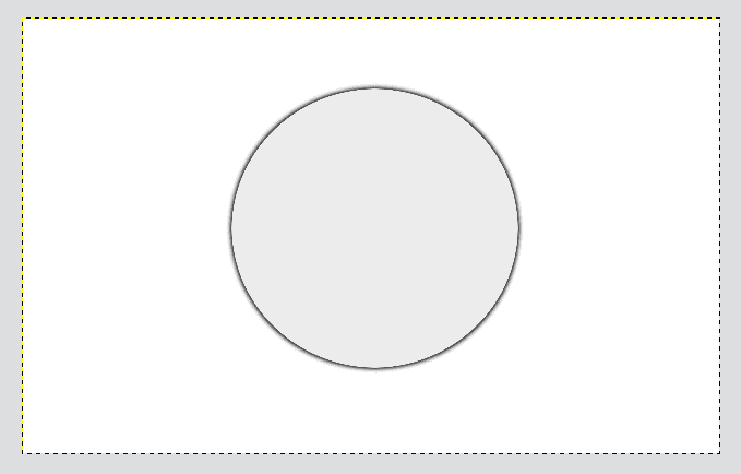
So far we have the basic shape in a dark color and another layer with the body of the team in another color (preferably in a contrasting color with the background). We are located in the layer of the basic shape and we are going to Filter » Blur » Gaussian blur with a value of 5 pixel and we already have the shadow effect, the result should be more or less this:
Creating the inside of the team
It is the turn of creating the interior of the equipment, which is really the most laborious because we will use layer masks, fill patterns and an optical trick to give an impression of volume and simulate the classic acrylic cover.
To create the interior we create a new layer and return with the same operation of Alpha to selection only now we use the team edge layer. We return to the new layer and in the menu Select » Shrink We use a size of about 5 pixels and then we look for the color that we will use for the background of the computer screen.
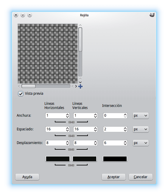
We fill in the color and go on to create what would be the scale of the equipment that in "GIMP language" does not go beyond a grid. We create a new layer and we will Filter » Rendering » Boss » Rack We choose a color (preferably green) that contrasts with the background of the equipment and we apply the effect.
A fill is created like a grid but that covers the entire layer so we have to cut it so that it is only on the inside of the computer screen.
To cut the grid we return with the Alpha to selection using as a base the layer of the background of the equipment (the one that we put in green) and then we are going to Select » Invert selection or if we press CTRL + I once this is done we press the key DELETE and voila… the grid fits our supposed screen.
To improve the adaptation we change the layer mode of the grid from Normal a Market and we lowered the opacity to 40% to remove a bit of "force".
The screen of our team
In our supposed team we will measure the pulses by simulating the films where they show the patients' position by means of a line, so we create our measurement line with its corresponding effect. To create a line we will use the tool Routes and then we will create the line from the path we created.
First we choose the color we want for the Route. We choose the tool Ruta and we trace the shape we want to give it.

Once the shape we want to give to the Ruta then we go on to use the tool options to create a line through the entire path we define

What would be more or less like this:
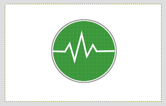
Once the route is drawn, we duplicate the layer of the line (which we preferably use with a color that stands out on our screen) to the layer below we make a Filter » Blur » Gaussian blur and we move on to work on the line layer above.
To give an opaque effect to the Pulse we create a layer mask (right click on the layer » Add layer mask) and we choose the default color values (D). This will put a white box next to our layer.
Later we change the Foreground (White) and Background (Black) colors, right-click on the new layer and select Show layer mask. This will leave us all blank but don't worry. We choose the Gradient Tool (we must have the option of Bilinear Gradient) and we draw a line and apply it from the center of the layer horizontally out of the layer.
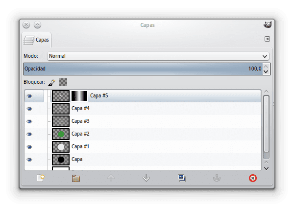
We uncheck the option Show Layer mask. If we look at the layers dialog we will see something like this:
By doing that we see that our top line reappears and the result is quite good.
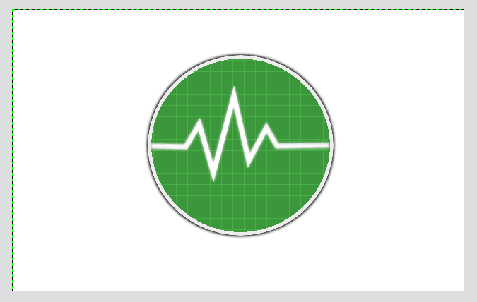
Notice that now the edges of the line have a kind of gradient, as if it were fading. This of course can be much better.
The acrylic lid of the kit
As we mentioned at the beginning, we will create the illusion that it has a transparent acrylic layer, which gives the notion of volume to the team, so we will need a gloss layer to simulate acrylic as well as its respective inner shadow.
To achieve the inner shadow we create a new layer and do the step of Alpha to selection using the layer at the bottom of the screen then we return to the new layer and shrink (Select »Shrink) with the value of 1 pixel.
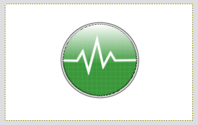
Once the selection is shrunk, we fill it with black. Later, on the same layer of black color, we do the step of Alpha to selection and we return to Select »Shrink this time with a value of 2 pixels. You will see that we have a black circle left, we apply a Filter » Blur » Gaussian blur with value 5 with which we obtain something like this:

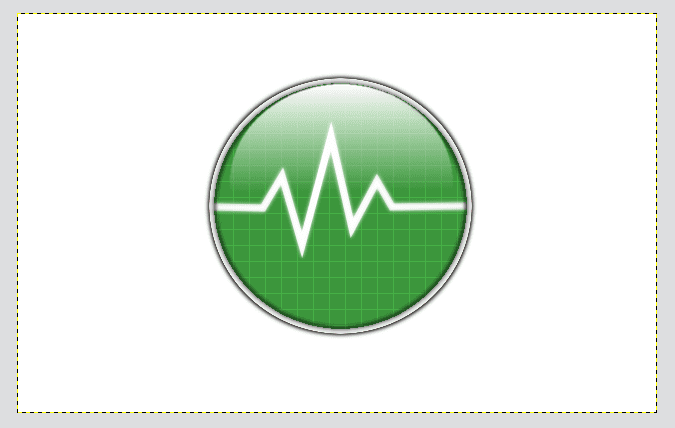
It is the turn of creating the acrylic lid for which we create a new layer and do the same step of Alpha to Selection using the screen background layer as the base.
We choose the tool Degraded putting the white color on top of the black, and in the options we choose a shape Linear and a gradient from Facing Transparency, then we apply it from top to bottom trying to have a shape as vertical as possible:
To give a better appearance we are going to reduce the size of the glitter layer to make it smaller and make it look like an acrylic sphere, which concludes our tutorial with the complete result:
So far our modest tutorial, we hope you get excited and try to do it.
Very interesting article. When I can I will. 🙂
PS: It's called an electrocardiogram.
I knew they are called oscilloscopes.
Electrocardiograms are an application of the oscilloscope that is used to graph the work of the heart, so they have the "cardio" in between.
But oscilloscopes can have thousands of applications in seismology, electronics, sound, etc.
My mother * o *
What a good tutorial, it gives me an idea for many other things 😀
Thanks Elav !!!
Very good tutorial ...
Congratulations
Good tuto. It reminds me a lot of what I did with CorelDraw and Illustrator with those icons.
Good… but even though I don't comment much (and I spend more time on GUTL) I also have an account here on DesdeLinux. I see that you followed the tutorial because in the original I did not put the interface of the grid patterns or anything like that but your way it looks much better because it is more explained and can be understood better.
Yes, it is true that you have an account here ^. ^
very good
With these post, it is more than clear to me that I can do without phtoshop ..
thanks ..
I still have not detached myself from Illustrator or InDesign.
And nobody cares about your problem 😛 Take the firewood and eliotime3000 to the bonfire !!! XD
Very good tutorial, definitely GIMP is an excellent tool.
A query: which theme are you using on your linux system, it's great, I'd like to get it please.
Thanks and regards…
KDE with Oxygen .. that is, by default. What happens is that the colors are changed and I choose the scheme called Chrome 😀
Great, just a question, how to install it in Ubuntu 14.04 using Flashback Session, I already installed oxygen-gtk 2 and 3 in the software center, but I have no window decoration: - / only the gtk theme but it does not change the title buttons .
Greetings.
It is that Oxygen is from KDE. There are themes to emulate, but it will never be the same .. 🙁
Wouldn't it have been easier to do this in Inkscape? You also gained the advantage of being able to scale the final result at will.
Exactly, it's not to disparage Gimp but Inkscape is the right tool for this.
To be honest…. in my life I have opened inkscape, so I would not know if it is easier or not. It is true to scale the result but I have no idea how it works in a vector manner so I keep sticking with GIMP xD
I would have done it in Inkscape, but the post is not really mine. Also, I learned a couple of things with GIMP that I didn't know 😀
Then I would like someone to do something like this in inkscape to be able to compare them, that is the weight, the sharpness etc etc of the creation in inkscape and gimp ... and if it is not too much to ask you to put a step by step tutorial on how to do it to see if one is taking something xD.
I have to try it, thank you very much, it's very good 😀