Lo announced not long ago and it has already come true: DesdeLinux has a new theme for 2015 :). The idea was always to use what we already had, but in a different way. In a certain way we return to the old style of the beginnings of DesdeLinux, but with a more modern touch.
The main novelty is that for this version we changed CSS / JS framework. We previously used Bootstrap and now we use Foundation, and many have asked me why the change was due. It was a simple decision, I tried to layout the same theme in HTML in both frameworks and with Foundation I did it much faster.
Let's take a closer look at the details of the new theme, from top to bottom.
New arrivals
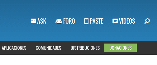
At the top we find a change in the structure of the main menu. Now we highlight the services we offer in DesdeLinux, passing the rest of the links to a secondary menu that for now will only be seen on all devices with a resolution greater than 640px.
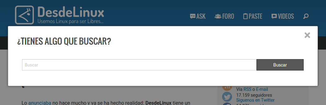
The search engine is now displayed as a pop-up window, and although it is now displayed in a simple way, we are thinking of providing it with search filters to show results by tags, categories, etc.
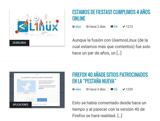
on the other hand, as I said at the beginning, looking for a more classic touch, we abandoned the «cards», at least in this previous version, and returned to a more traditional way of displaying the published posts. The only difference to highlight is that the Category to which the article belongs is now displayed on the image.
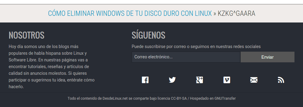
The "Featured" articles that were previously displayed at the top, now appear on the Footer, which has also been renewed to show only basic information about who we are and all possible ways (social or not), from follow us.
This is on the main page. When we access the posts, the only thing we find again is that it now shows when the article was created and when it was modified. This is useful since an article that has been published long ago can be modified or corrected and we can know when it was.
On the other hand, some users have reported to me that now the design has slimmed down and that on monitors with 1080p resolution it looks somewhat narrow. Unfortunately it may be true, but this is because of the Foundation 😛
For this version I used a 12 column Grid, so I would have to try a 16 or 24 Grid to see if this fixes.
What is pending?
There are other details that are pending and I will try to solve them as soon as possible, therefore for the ToDo it remains:
- Show the penguin from Go Up again.
Put a Lightbox for when we click on an image.Correct the width of the design.Use local fonts and not Google ones 😛Add buttons to share on social networks.- Anything else that appears along the way 😀
And that's all dear friends. Any feedback you offer us is more than welcome, because this topic is in BETA status.
The search bar is very cool and original to me.
If later they put filters for the search by tags and things like that (which is really needed in the meantime) it would be the icing on the cake.
Very good everything as always, although I do not appreciate much change, a face wash always feels very good ...
Keep in that way.
Greetings.
Thanks Ivan ..
Create a #bitcoin wallet in coinbase so that you can accept donations and you will see how donations arrive. Elav is very easy if you want, then I will explain how it works more thoroughly
In fact I have already created one 😀
It is true that the design of the page thinned… I like xD. Although there may be annoyances regarding wasted space. Apart from that I loved the design, it is the face lift that was needed. They could leave it for a while and solve the space thing, but so far I like it 🙂
I like the topic very well
Congratulations, keep it up guys. Greetings from Bogotá
Hello!
The new design is great, the previous one was not bad. But I also like the visualization in the form of a card.
Do you think you can update the article on how to install or remove programs?
There are some things that I want like Thunderbird in Spanish, but no idea how to do it.
Greetings.
According to the image of the post, a lower menu appears and I don't see it… why is it ???
What resolution do you have?
1024 x 768
Well, you should see it without any problem. Could you send me a screenshot to my email?
It's great.
Regards,
Videos promises a lot, just great.
I think the new topic is excellent, congratulations ..
By the way, when I click on the "search" button in the search bar, it sends me to the following link https://blog.desdelinux.net/wp-content/themes/DesdeLinuxV6/...
which does not happen when pressing enter inside the text box.
regards
It should already be corrected .. thanks for reporting it.
For the images you could use intesejs D:
https://platzi.com/blog/intensejs/
Thanks for the suggestion 😀
what is the difference in using local or google sources?
In reality, for a user who lives in a normal country, none, but in my country many companies have a policy of blocking all sites and opening only "some authorized ones".. If Google Font is not among those sites, they will not see the images correctly. sources... believe me, I know many cases. Therefore, if they manage to enter DesdeLinux, they won't have that problem.
And why not download the Google fonts and store them on the server so that you don't have to invoke them from Google Fonts?
In my opinion, the "container" where the articles appear is too small.
They are 1000px, in 8/4 parts ... this makes the article column have 600px approx.
Taking into account that the most used screen resolution is 1366 × 768, a lot of space is wasted and the reading area becomes a bit small.
Yes, I'm working on it 😉
Yes, I definitely like this style better even if it hasn't changed much, details are always very important.
I have seen the site on a CRT screen and the truth is that the typography fits perfectly for these monitors (for the resolution 1024 × 768, it is just perfect).
I like it!!!!
The new topic is very sketchy ... congratulations at good time lol.
Elav, is there a course you took to do the projects in foundation? What happens is that I want to learn it but I don't know where to start
I wouldn't know how to explain it to you, but at the moment I would take that topic as a reference and later materialize it in a Drupal topic.
The documentation is very good, if you read it you may not need any courses. 😉
Of course nothing .. reading and that's it .. the documentation as they told you, is quite good .. although of course, you must have some knowledge of HTML, CSS, JS ..
Not bad but I still see it too narrow. On a monitor like mine, 1080p HD (1920 × 1080) is barely a vertical strip in the center of the screen.
I've always hated narrow themes or templates.
To be honest, I've gotten used to narrow subjects by now because I've practically worked my entire life with 4: 3 or "square" picture aspect monitors (16: 9 or "wide" picture aspect monitors are ideal for work in design and / or videogames, but if on the sides you cannot see a background that is in harmony with the vertical site, then it makes no sense to enjoy that site).
Anyway, between tastes and colors ...
I don't know what you think Elav, but sometimes I would like to give a positive vote to some comments. 😉
You have to find a plugin for that.
Congratulations on the new theme!
For me there is only one small downside: that the "Featured" are below. It was a link that I visited many of the times I entered the page, even if there were no new articles.
Now it is more uncomfortable to go down to the bottom (and after a few days I have noticed that most of the time I enter the page I forget to go down to look at it).
I would like it to be up again, if you don't think so
This is the same as those changes that nobody asks for but they are only the developer's taste .. the previous design was much more polished and only details remained .. now .. to start again .. very linux this. But hey, go ahead.
I would understand that someone would get upset if we changed the way posts are displayed, if we put black backgrounds and white text on top, if we affected usability or accessibility, but I don't think that was the case. Maybe yes, it is just a whim, but renewing yourself never hurts.
Very good !!
I love the design !! Great job!
Regards!