Greetings to all:
I keep making small changes and adjustments to the Design of DesdeLinux and this time the most relevant thing I bring you is the way we will see the code from now on.
That is, for editors and collaborators it does not represent any change, but when they put text in the form of code with queues o pre, For example:
$ echo "This looks like a terminal"
o
$ echo «Esto parece un terminal»
now it will look like this:
$ echo "Esto parece un terminal"
In other words, with the upper edge of a terminal, with its buttons and title bar included. What's cool? Now our code will be seen in a terminal without using an image for it 🙂
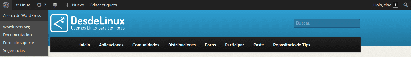
Another detail that is incorporated is that now registered users have the WordPress top bar back, which includes shortcuts for some relevant tasks:
Well, I have optimized a bit of code, I have removed what is not used and so on.
Great .. ..the first thing I noticed when entering the blog .. is the change in the size of the letters .. Doesn't it seem too small?
Perhaps it is due to the habit of seeing them in the previous size ... but at least in the comments it seems to me that they made them too small ...
And as for the code tag .. ..it has to be yes or yes ´bash´ ee .. ..there are those who use zsh .. 😉
Let's not get fancy. I mean the bash thing. Yes, many use zsh but it is the minority and the objective is not to say that bash is the most used, but that it looks more beautiful when code is put in.
About the font size in the comments, right now I check.
Uhh, you already started discriminating against minorities.
Zsh users, come lynch him. xD
The point is does it really matter if it says bash or zsh?
No, not really .. ..it was just an observation .. in case it had not been taken into account .. ..dictators everywhere .. xP
Done, letters a little bigger 😛
Perfect :) .. ..and the code tag looks cute .. but the bash in the middle I see it unnecessary .. jumm ..
Well, he stays .. this is not a Democracy JUAZ JUAZ JUAZ… come, come detractors of Shuttleworth and lynch me !! xDD
Nothing nothing,
¡bash rules!eliotime3000 @ eliotime3K: ~ $ su
Password:
root @ eliotime3K: / home / eliotime3000 # cd / dev / null
NOTHING TO DO HERE
root @ eliotime3K: / home / eliotime3000 # exit
eliotime3000 @ eliotime3K: ~ $ exit
Did my bash go well?
eliotime3000@eliotime3K:~$ suContraseña:
root@eliotime3K:/home/eliotime3000# cd /dev/null
NOTHING TO DO HERE
root@eliotime3K:/home/eliotime3000# exit
eliotime3000@eliotime3K:~$ exit
How about now?
Since we are:
-The source of the commenter's name and comment date is still very small.
-In Chromium, the cover cards are still lying on the left.
-For those who comment from Ubuntu, a lost image appears instead of the Unity logo.
I'm using Chromium right now and I don't see anything thrown to the left. What resolution are you using? About the source of the commenter's name, it can also be fixed .. in a few minutes.
1280 × 800
This is a screenshot taken from a new profile: http://i.imgur.com/Xw1SJeI.png
I know that feels, bro.
In the same way, this same problem also appears to me.
According to Manuel de la Fuente, in Chromium it appears to me with the same effect (in the same way with Google Chrome) >> http://i.imgur.com/3b2FBeZ.png
appears "normal" in Chromium 30
http://box.jisko.net/i/b2955f97.png
I already found the solution, but implementing it changes a lot of things. Therefore, I have to make the adjustments calmly. 🙂
Very nice graphic. This starts to fly more every day. I like it. Greetings 😀
🙂 Thank you ..
Well, since asking does not cost anything, would it be possible for the little window to respond to posts to have a toolbar? I mean, to select bold, italic, code, img, etc. Thus one could respond to a post in a more elegant way without having to know the necessary html tags by heart.
I think the same
$ echo “Esto me parece genial :D”Elav, the layout of the site does not look correctly in Google Chrome (Mac OS X), it has been like that for a long time but I hardly realize it from the announcement of the terminal design (which by the way was very good for you).
I am sending you a couple of screenshots so that you can visualize the problem.
Firefox: https://www.diigo.com/item/image/11ou0/9nhw
Google Chrome: https://www.diigo.com/item/image/11ou0/1tv5
It seems great to me along with the font size….
I find it excellent that they enabled the top bar of WordPress. At least it makes my life easier when writing an article or two.
And I can finally use the code! At least, it is quite useful to differentiate commands from the explanation of texts.
every day they surprise me more with their design on the blog …… keep it up !!! By the way the new design is super original !!
I thought it was only happening to me, but reading the comments I think not.
In the main page everything looks very stuck to the left (It is not centered). I use Chrome and a resolution of 1280 × 1024.
Cheers!! Excellent Blog
Hi Elav
I have downloaded the theme a long time ago. I wanted to use it back then and it didn't work. I thought something was wrong. I am manually entering it in the theme folder, however it does not work.
When you click preview or apply, everything is displayed without any style, only the texts are seen.
I don't know what it could be, any advice?
By the way, I wanted to download it again just in case and the link no longer works.
Thank you very much.
Greetings.
Sorry this was for input: https://blog.desdelinux.net/liberado-el-tema-para-wordpress-de-desdelinux/ I had it in another tab.